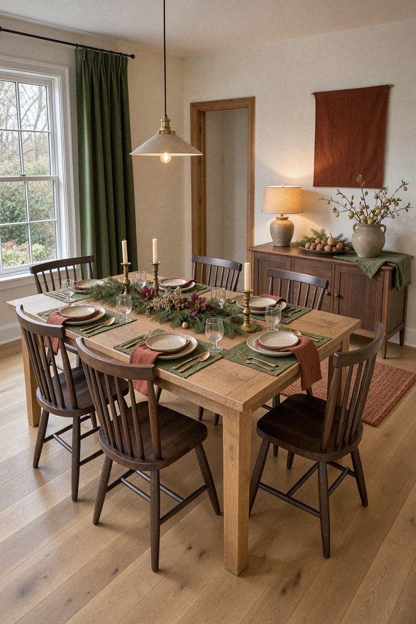
I Found Vintage Christmas Table Settings From the Charity Shop, My Table Feels Festive
20 october 2026Vintage Christmas table settings from the charity shop made my dining room feel festive for about $100 to $300, depending on what I already owned. I had one Saturday, a scratched table, and no matching dinnerware. The result feels gathered, warm, and beautifully personal. Better still, I didn't need a complete room makeover.
The table was plain natural oak with a dull patch near one end, and the chairs didn't match. One had a cane back, two were painted cream, and the last one belonged in another room entirely. I left them that way because the mismatched shapes felt more honest than a rushed furniture set.
The room had no Christmas color beyond a rust tea towel near the kitchen. The pendant hung too high, the walls were pale, and the table looked lost under the ceiling light. I started with the table instead of buying more decor, then built the room outward from there.
Editor's note: A vintage Christmas table doesn't need a matching dinnerware set. Start with one warm material, one restrained color, and something with a little history. The rest can arrive slowly.
- Start with the Two-Wood Rule for vintage Christmas tablescapes
- Layer mismatched china with one repeated color
- Choose brass candlesticks over a matching centerpiece
- Build the Three-Height Light Stack
- Mix velvet and linen instead of buying a holiday set
- Frame each place with the Twenty-Four-Inch Rule
- Paint the backdrop with Farrow & Ball De Nimes
- Swap a formal runner for a faded textile
- Anchor the room with one antique sideboard
- Hang the Three-Foot Chair Clearance
- Mix silver and brass for a warmer vintage Christmas
- Frame the table with a quiet gallery wall
- Use Sherwin-Williams Urbane Bronze for contrast
- Finish with a Bowl-at-the-Edge arrangement
1Start with the Two-Wood Rule for vintage Christmas tablescapes
I began by limiting the table to two wood tones: the natural oak tabletop and a darker walnut tray. That small decision stopped the charity-shop pieces from looking random. Your eye needs somewhere to rest, and two related finishes give you quiet structure without making the table feel stiff.
I found the tray for $8 and used it to hold the glass salt cellar, taper candles, and a little bowl of clementines. The grain felt warm beneath my fingertips, while the oak kept the arrangement relaxed.
I’d skip adding a third wood tone here. Too many shades would compete with the old ceramics.
The darker tray became a handsome visual anchor beside the natural oak tabletop. It also made the whole setting feel more intentional, even though nearly everything came from a different shop. If you’re working with a small room, the two-wood rule is an easy place to begin.
But I didn’t polish everything until it gleamed. You’ll want a little wear to remain visible because those scratches keep the table from looking like a showroom. The unlacquered brass candlesticks brought a warm patina to the setting, and the whole arrangement took less than twenty minutes to assemble.
2Layer mismatched china with one repeated color
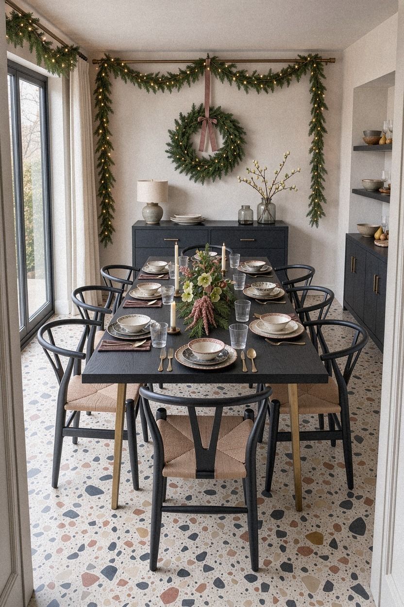
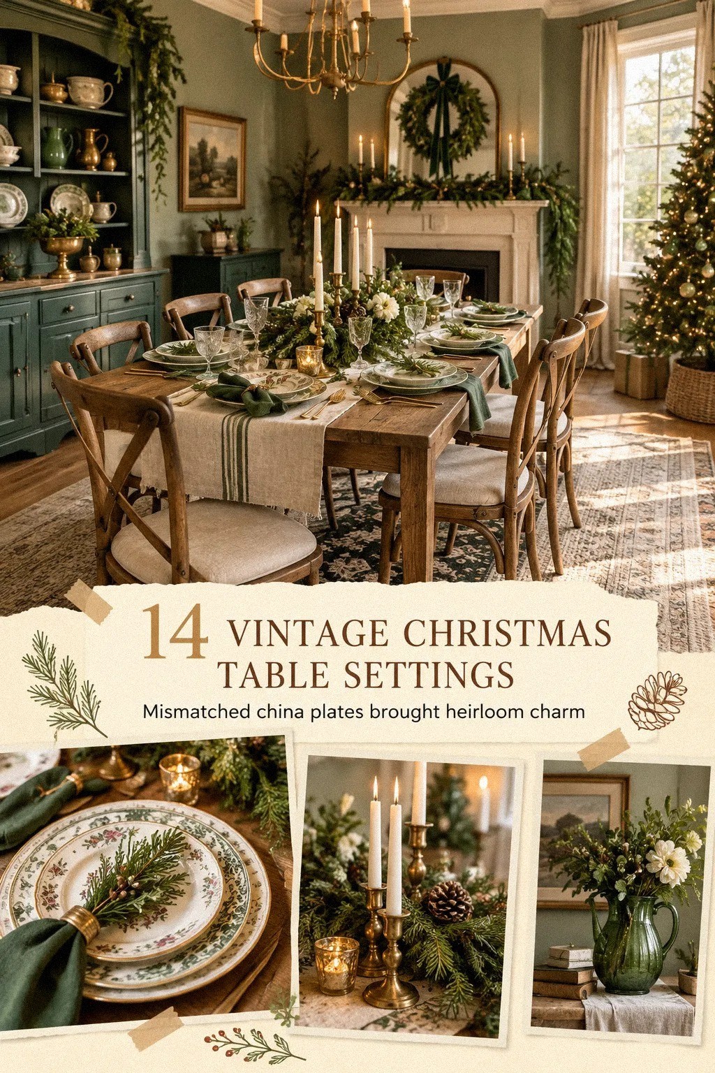
The first charity shop had shelves of plates, but I chose pieces that carried dusty rose, charcoal, or a muted brass note. One dinner plate had a charcoal rim, another showed a faded rose pattern, and the side plates were plain warm white. Your table doesn’t need matching china when one repeated color links the collection.
I placed the warm white plates underneath the patterned ones and kept the patterns at different angles. That made each place setting feel collected, not copied. Charcoal stoneware plates gave the table a calm foundation, while brass details added a gentle glow.
The dusty rose details were subtle, but they gave the table a soft, quietly festive feeling. I also added rose-toned side plates and charcoal dinner plates so the color appeared several times without becoming a theme. An oversized-chip terrazzo surface nearby added useful texture without competing with the dishes.
And I made one mistake here. I bought four floral side plates because they were cheap, then realized every pattern was competing with the centerpiece.
I removed two. You’ll get a stronger result if you let some plates stay quiet, even when the charity shop has a tempting stack.
For another approach, compare this restrained palette with the faded textile idea. Both use repetition, but the fabric brings more softness.
3Choose brass candlesticks over a matching centerpiece
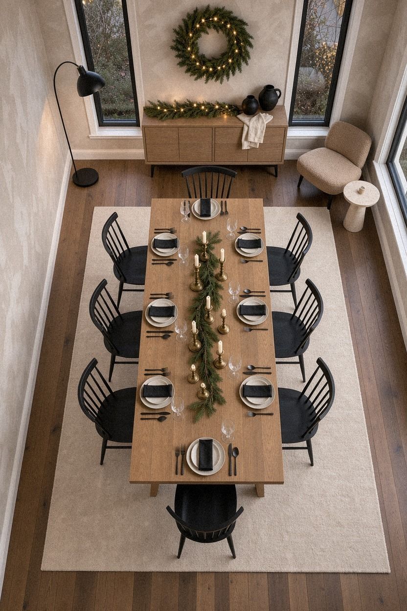
I wanted candlelight, not a large arrangement that blocked conversation, so I gathered three brass candlesticks from different charity shops.
4Build the Three-Height Light Stack
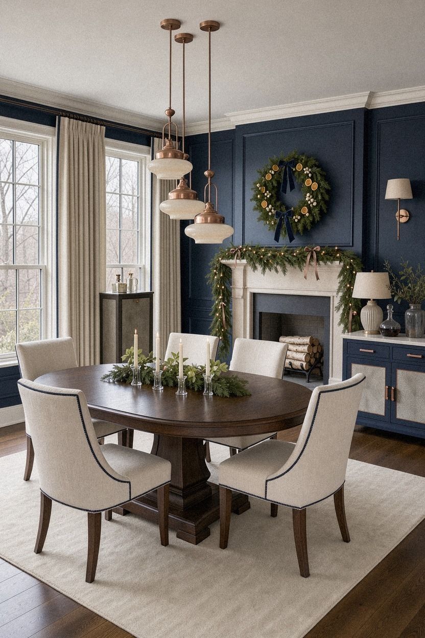
The pendant was still too high, so I balanced the table with three visual heights: low plates, medium greenery, and tall candles. That simple stack made the room feel more finished without adding much. Your eye moves upward, then returns to the place settings instead of stopping at the empty space above the table.
The copper pendant already hung in the room, and I lowered it to sit 30 to 36 inches above the tabletop. That range kept the light close enough for warmth while leaving room for conversation. I used fresh rosemary branches in a midnight-blue vessel and let an ivory candle rise just above them.
The rosemary gave off a crisp, woodsy scent whenever someone brushed past it. A few ivory taper candles added a soft note, while the shagreen tray kept the centerpiece grounded. Nothing felt overfilled.
If you’re working with a fixed pendant, don’t worry. You can create the same effect with a tall bottle, a bowl, and two candlesticks.
I’d choose a slightly crooked bottle over a perfect vase because it adds character. The room felt softer as soon as I turned off the overhead light.
The brass candlesticks did most of the work, but the height variation made them feel architectural.
5Mix velvet and linen instead of buying a holiday set
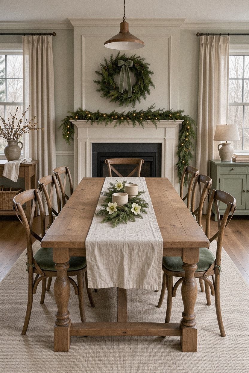
I didn’t buy Christmas napkins. I used two napkins from my linen drawer, then found a pair of sage-green cloths for $4 at the charity shop. The fabrics were different, but the color family held them together.
Your table will feel more collected when textures vary while the palette stays narrow.
The washed Belgian linen napkins softened the sharp edge of the plates, while the sage-green cotton napkins added a small seasonal note. I folded each napkin into a loose rectangle and tucked a sprig of rosemary underneath. No rings, no complicated fold, and no extra shopping trip.
The linen felt relaxed and tactile beside the smooth warm cream dinnerware. The natural wood chairs added a richer note without turning the table formal. That contrast kept the room inviting.
But I’d skip shiny polyester if you want a vintage look. It catches candlelight in a harsh way and slides around the plate. You’ll get more warmth from washed linen, cotton, or even a tea towel cut in half.
The fabric should look comfortable enough that you’d use it again on an ordinary Sunday.
You can borrow the same restrained approach from the mismatched china and repeat one color instead of matching every texture.
6Frame each place with the Twenty-Four-Inch Rule
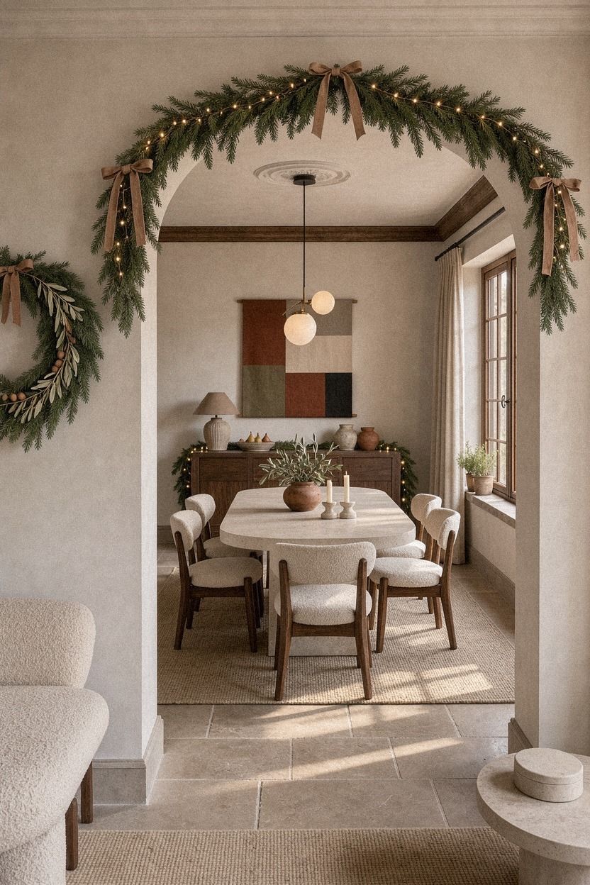
I measured the table before placing anything because crowded settings are hard to enjoy. The useful guide is 24 inches of table width per guest. My six-person table could handle six settings, but only if the centerpiece stayed narrow and the serving dishes moved to the sideboard.
The terracotta stoneware chargers gave each place a clear boundary without taking up much room. I set the dinner plates in the center, left enough elbow space, and kept the brass cutlery close to the plate. Your guests shouldn’t have to protect their water glass from a candle or reach across a centerpiece for salt.
And I made one mistake here. I wanted to squeeze in one more chair. I didn’t.
A table can look generous and still feel cramped once everyone sits down. You’ll enjoy the meal more when the settings have breathing room, even if that means serving one person at a nearby console.
The measurement also helped me decide where the small water glasses should sit. They belonged above the knives, outside the candlelight, where guests could reach them easily.
An organic bouclé seat added comfort without crowding the tabletop. Practical details made the room feel calmer.
If your table is narrow, return to the off-center centerpiece rather than forcing everything down the middle.
7Paint the backdrop with Farrow & Ball De Nimes
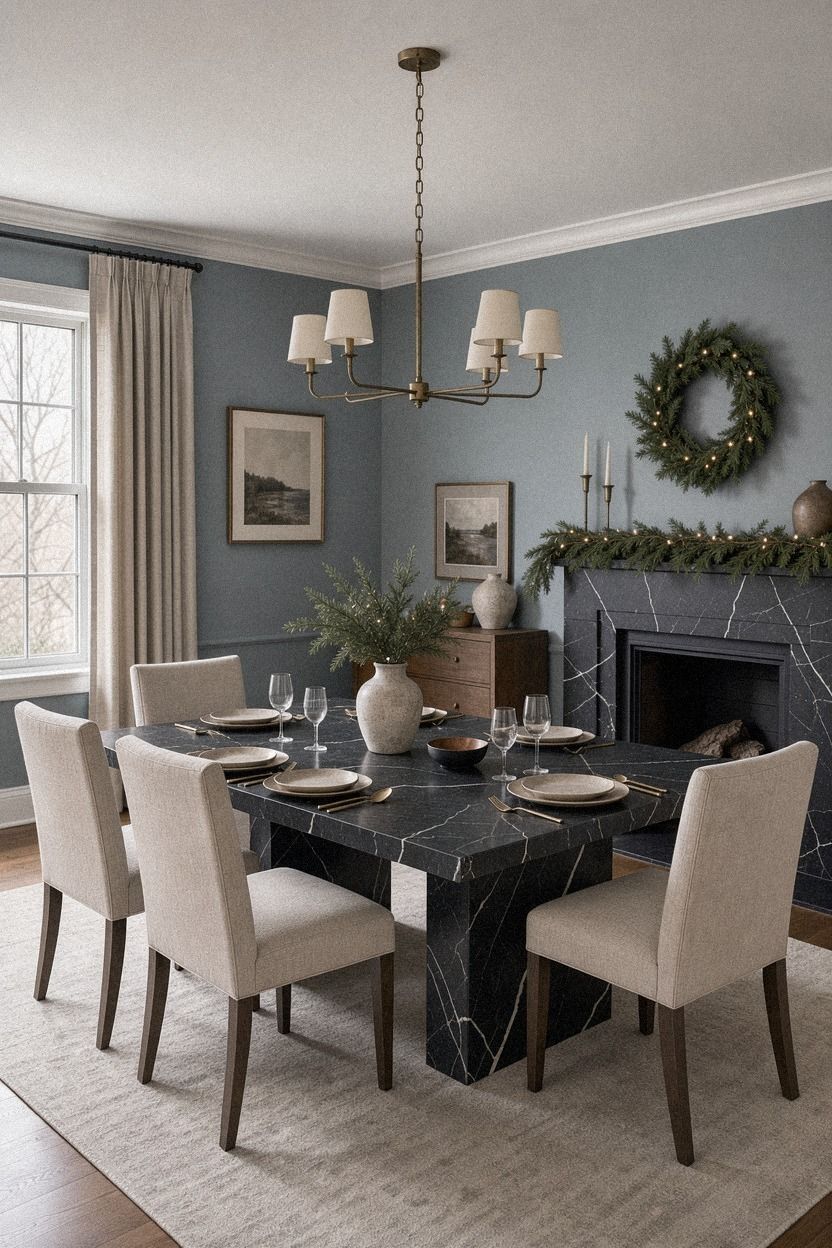
The pale walls made the old dishes look slightly washed out, so I tested Farrow & Ball De Nimes No. 299 before settling on a clay-toned finish for the dining nook. The warmer wall color gave the table more depth and worked beautifully with the linen textiles and aged brass.
I added a narrow Nero Marquina marble ledge beneath the art, choosing a piece with white veining rather than a polished shelf. It gave the wall a grounded, substantial note without requiring a full renovation.
The clay backdrop made the natural oak and brass feel warmer. It also gave the cream dishes somewhere to stand out without making the room feel dark.
If you’re renting, use a painted board behind the sideboard instead of changing the wall. A small sample can still show you how the color behaves beside candlelight and old ceramics.
8Swap a formal runner for a faded textile
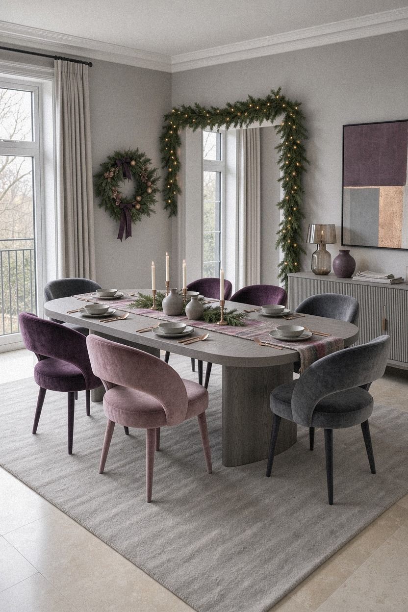
A charity-shop textile had a small stain near the middle, so I cut it into a long runner and turned the damaged section toward the wall. The fabric had a faded plum stripe and a soft, deep-pile feel. Your table doesn’t need a pristine textile to look ready for guests.
The mohair velvet runner created a visual path from the candlesticks to the bowl of fruit. I left plenty of wood showing at both ends, which kept the arrangement from feeling heavy. A narrow runner is also easier to store and wash than a full tablecloth.
The plum stripe looked especially beautiful beside the soft grey wall color and rose-gold accents. It added a nostalgic, welcoming note without covering the wood that gave the table its character.
If you’re using a full cloth, let it drop evenly on both sides. I’d avoid a short cloth that barely reaches the edge because it looks accidental rather than relaxed.
You can use a scarf, a fabric remnant, or a folded blanket if the weave isn’t too thick. The faded stripe made the whole table feel more inviting.
A worn textile can do as much visual work as the painted backdrop, especially in a rental.
9Anchor the room with one antique sideboard
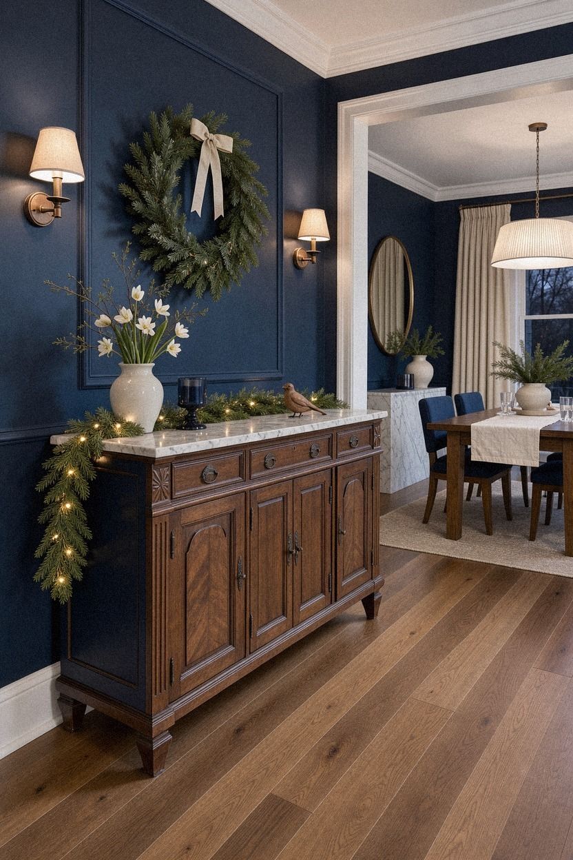
The sideboard became the practical part of the makeover. I found a small walnut sideboard for $65, and its drawers held serving spoons, candles, and extra napkins. That meant the dining table could stay clear, which changed how easily I moved around the room.
I placed the sideboard against the wall opposite the table and styled only the top third of it. A framed botanical print, one small table lamp, and a shallow Carrara marble tray were enough. Your storage piece should support dinner rather than become another display surface.
The walnut brought a sturdy, handsome quality to the room. It also gave the lighter white chairs a richer neighbor, so the mismatched furniture looked deliberate rather than accidental.
But I’d skip filling every drawer before you know what you need nearby. I kept reaching for the same three items, so I moved those to the top drawer and left the rest alone. The room felt calmer because the useful things were close and the visual noise stayed low.
The sideboard also made the 24-inch place-setting rule easier to follow because serving dishes had somewhere else to go.
10Hang the Three-Foot Chair Clearance
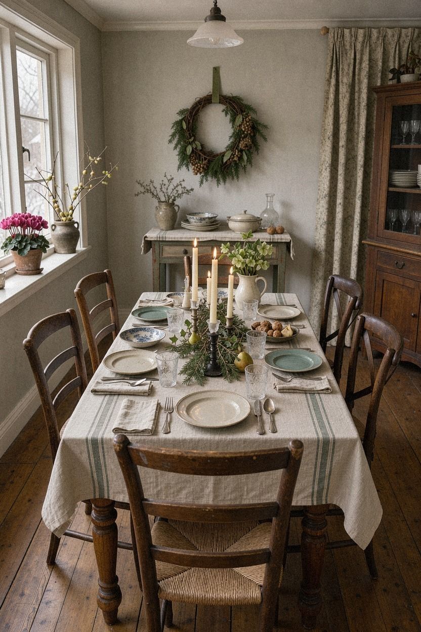
The chairs looked charming in the charity shop, but they were awkward around the table. I left roughly three feet of clearance behind each chair, then kept the emerald upholstery, cream walls, and small gold accents simple. That gave everyone room to pull back from the table without disturbing the sideboard.
11Mix silver and brass for a warmer vintage Christmas
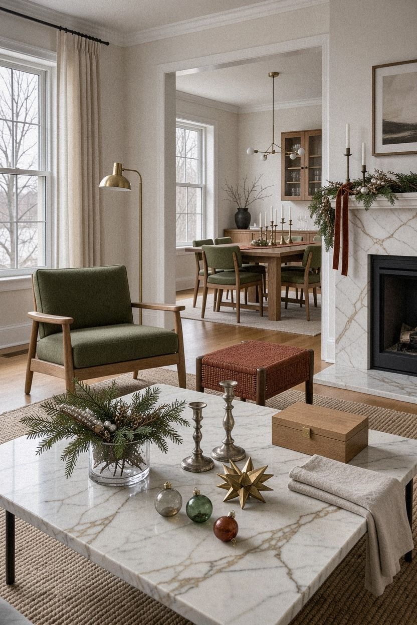
I found a silver gravy boat and two brass serving spoons in separate boxes. At first, I thought they’d look unrelated, but the mixed metals gave the table a gentle shimmer. Your vintage setting doesn’t need one strict finish, especially when the objects are tied together by age and use.
The silver-plated gravy boat sat beside the brass candlesticks, and its slightly cloudy surface reflected the candle flame in a soft, uneven way. I placed both on a Calacatta marble slab with subtle gold veining. That kept the arrangement from becoming too shiny.
The silver gave the table a crisp highlight, while the brass kept the mood mellow and warm. Together, they felt festive without looking glittery.
And I didn’t polish the silver until it looked new. The darker areas gave it depth, and the room felt more charming because the pieces carried a little history. You’ll want to clean anything that touches food, but you don’t need to erase every mark from an old serving piece.
That mix also echoed the copper pendant, which helped the different finishes feel connected.
12Frame the table with a quiet gallery wall
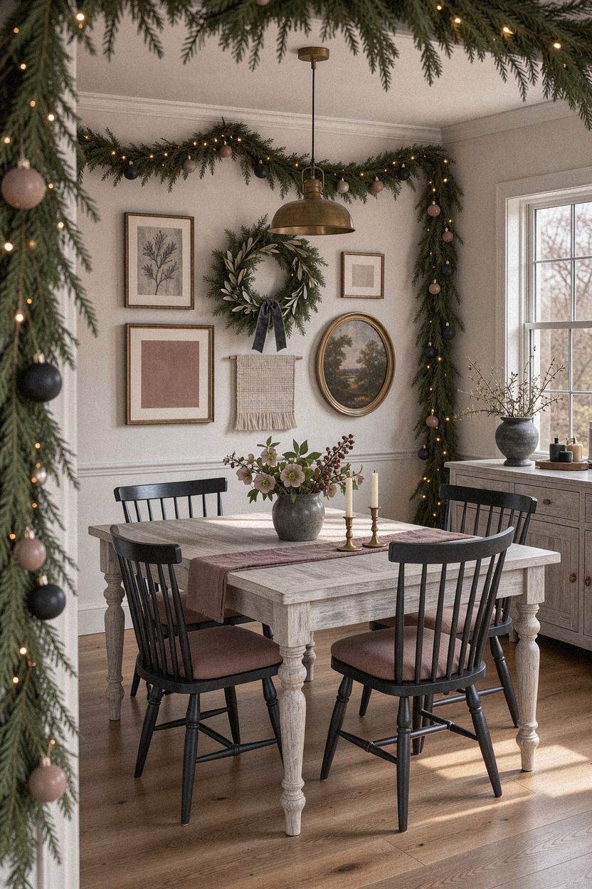
The wall behind the sideboard needed something, but I didn’t want another Christmas sign. I used three small charity-shop frames with botanical prints and old landscape sketches. Your dining room will feel more personal when the wall art connects to the table without repeating every color.
The cerused white oak frames added a lighter edge against the charcoal wall. I arranged the frames in a loose triangle, with the lowest one close to the sideboard and the highest one near eye level. The spacing wasn’t exact, and that helped the group feel collected.
The dusty rose garden print brought in a soft note, while the charcoal landscape sketch added a quiet, nostalgic mood. A small brass frame caught the candlelight without becoming shiny.
If you’re renting, lean the frames on the sideboard instead of drilling into the wall. I’d avoid a grid here because the furniture and china already have enough structure. One print showed a winter garden, and it became the unexpected piece everyone asked about during dinner.
The loose arrangement worked because the table already followed the two-wood rule. Both choices leave room for personality.
13Use Sherwin-Williams Urbane Bronze for contrast
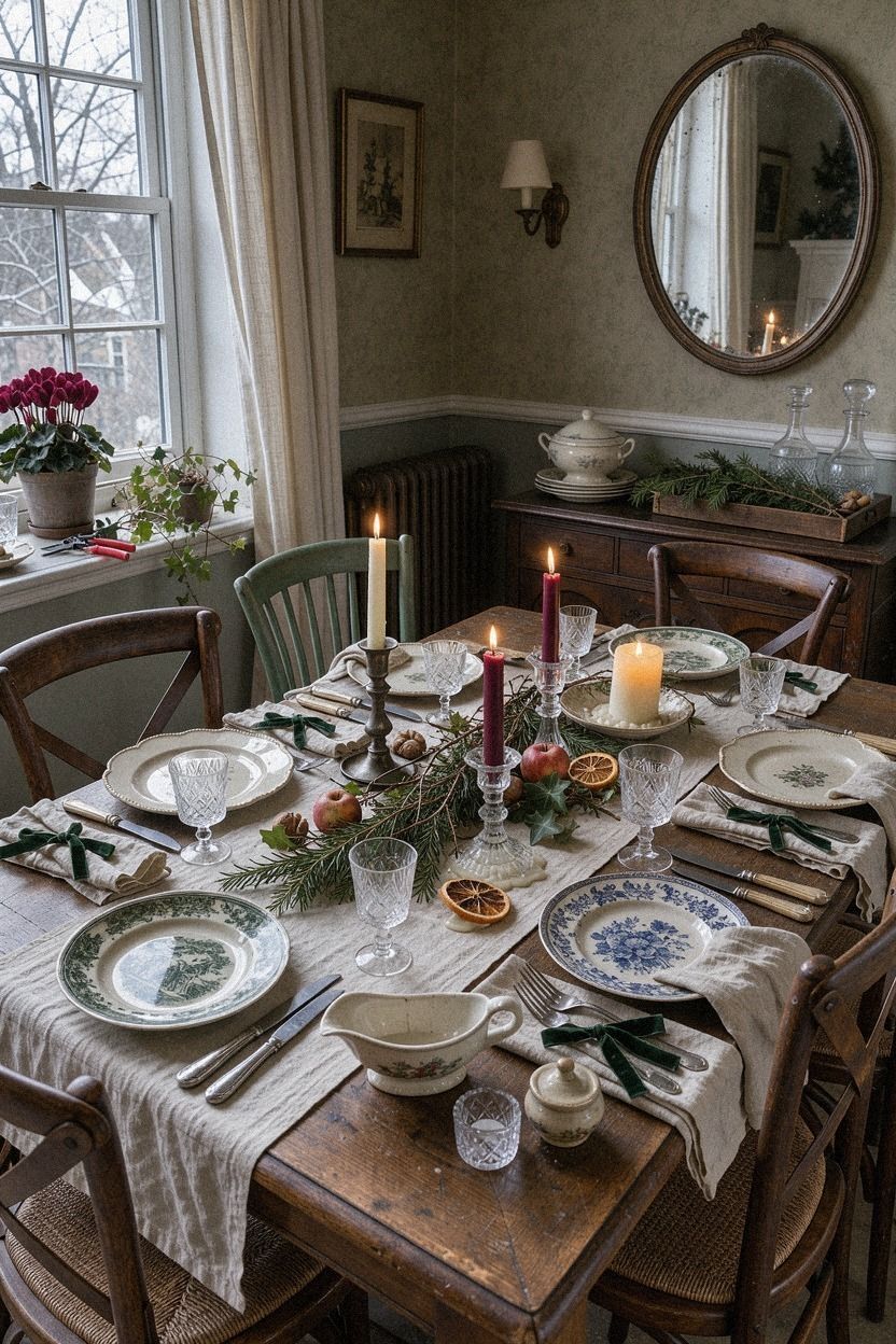
The table still needed one dark note, so I painted a small wooden candlestick in Sherwin-Williams Urbane Bronze SW 7048. The color tied together the black accents, warm cream dishes, and shadows beneath the plates. Your room may need only one deep tone to make the lighter pieces feel deliberate.
I placed a small backlit translucent onyx lamp on the sideboard. Its warm glow softened the black accents and added a quiet sense of depth without filling the room with more decoration.
The dark shade gave the table a grounded, confident feeling. It also made the cream tapers, warm white plates, and brass details stand out more clearly.
But I’d test a dark color before committing to a large piece. Urbane Bronze can feel earthy and calming in a warm room, but it may look heavy beside cool white walls.
You can use a frame, vase, or thrifted stool for the same effect. The dark candlestick gave the table its backbone.
If you want less paint, borrow the same contrast from the mixed metals.
14Finish with a Bowl-at-the-Edge arrangement
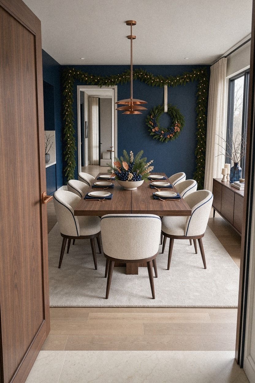
The final decision was to keep the centerpiece slightly off-center. I used an ivory bowl at the edge of the table, balanced by a midnight-blue vessel and a small copper accent. The book-matched walnut beneath the arrangement added enough pattern that I didn’t need more decoration.
How much it cost
The charity-shop pieces came to $100, including the walnut sideboard, walnut tray, plates, candlesticks, frames, runner, and fruit bowl. I used leftover paint, rosemary from the garden, and candles I already owned. That kept the personal makeover close to the low end of the range.
Typical dining-room project costs are much higher when furniture, lighting, or wall treatments are included. These ranges helped me decide where to spend and where to reuse what I had.
Here are other typical material ranges worth keeping in mind:
My table didn’t need the mid-range or high-end treatment. You’ll get more atmosphere from a few well-chosen pieces than from replacing everything at once. I’d spend first on lighting and seating, then add decorative pieces slowly.
For a smaller budget, start with the faded runner, brass candlesticks, and second-hand plates. Those three changes created the biggest visual shift.
Why I’d choose the charity shop again
I’ve styled plenty of tables with coordinated pieces, and they’re easy to arrange. They’re also easy to forget. This table stayed in my mind because every object carried a small question: who used this gravy boat, why was that chair painted cream, and how many Christmas dinners had those plates already seen?
The charity shop also forced me to make decisions. I couldn’t order six matching napkins or wait for a complete collection to arrive.
I had to notice the dusty rose glaze, the walnut grain, and the way the silver caught the candlelight. That limitation made the finished table feel more personal.
And I learned that festive doesn’t mean heavily decorated. Your table needs a place for food, elbows, and conversation. A warm lamp, three candles, and a bowl of fruit did more for the room than a crowded centerpiece would have done.
The only thing I’d change is the sideboard hardware. The original pulls are charming but awkward to open, especially when my hands are full.
I’ll probably keep them anyway. That’s the trade-off I like about second-hand pieces: they ask you to live with a little character.
The whole room became more beautiful because it wasn’t overly polished. The scratched oak table, faded textiles, and uneven brass finishes gave it a relaxed, memorable quality that new furniture rarely has.
A Few Things Worth Answering
What is the best vintage Christmas table setting from the charity shop for a small dining room?
A narrow runner, three mismatched plates, and low brass candlesticks work best because they leave room for food. A compact walnut sideboard can hold serving pieces nearby, while a 24-inch allowance per guest keeps the table comfortable. I’d also use one low bowl instead of a tall centerpiece.
Where can I buy vintage Christmas table pieces on a budget?
Look at charity shops, Facebook Marketplace, IKEA, Target, and Wayfair for supporting pieces. Second-hand dinnerware usually gives you more character for less money, especially when you search by one color instead of trying to find a complete matching set. I’d begin with plates and textiles.
How much does a vintage Christmas table makeover cost?
Expect about $100 to $300 for a small charity-shop makeover when you reuse paint, greenery, candles, and furniture you already own. Free garden clippings and existing textiles can lower the cost, while a sideboard or pendant will move the budget higher. My own table stayed near $100.
Can I create a vintage Christmas table setting on a budget?
Yes, and you can start with three inexpensive moves: gather greenery, reuse glasses, and shop your own cupboards before buying anything. A $6 fruit bowl or a $4 textile can change the table more than a large seasonal purchase. I’d spend slowly and wait for pieces with character.
Is a vintage Christmas table setting worth it in a small space?
Yes, because a small dining room benefits from fewer, more useful objects. An off-center centerpiece leaves serving space open, and lowering a pendant to 30 to 36 inches above the table adds warmth without taking up floor area. I’d protect the walking space first.
Is a vintage Christmas table setting a good idea for a rental?
Yes. Use removable hooks, leaning frames, a tension rod, and a small table lamp instead of permanent changes. A temporary fabric backdrop can add color behind the table, and you can take every piece with you when the lease ends.
I’d use paint samples on removable boards if walls are off limits.
Where I’d Start First
If I had to pick one, I’d start with the three brass candlesticks. Their uneven heights create candlelight across the whole table, and they make inexpensive plates feel intentional. You’ll notice the difference before dinner begins, so save the idea and try it tonight.