11+ Hacienda Style Bedrooms That Feel Collected, Not Decorated
30 may 2026The first time I walked into a real hacienda style bedroom, I didn't want to leave. Not because it was fancy. Because it felt like it had been there forever.
These eleven rooms get that right. Thick plaster, hand-forged iron, floors that have seen things. Collected, not decorated.
Deep Burgundy Adobe That Actually Earns Its Drama
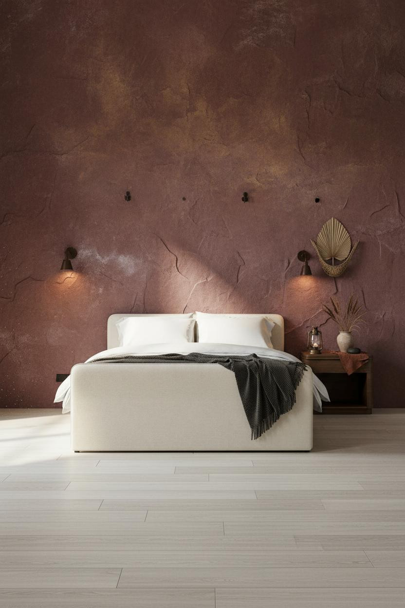


Fair warning. Burgundy plaster walls sound risky on paper.
But the thick troweled adobe surface shifts from deep wine near the floor to faded ochre at the crown, and that color drift is exactly what keeps it from feeling like a statement. It feels aged instead.
The part to get right: Pair it with bleached oak flooring underneath. The pale silver-ash tone pulls all that warmth back from the edge without washing the room out.
Why Spanish Wainscoting Works Better Than You'd Think
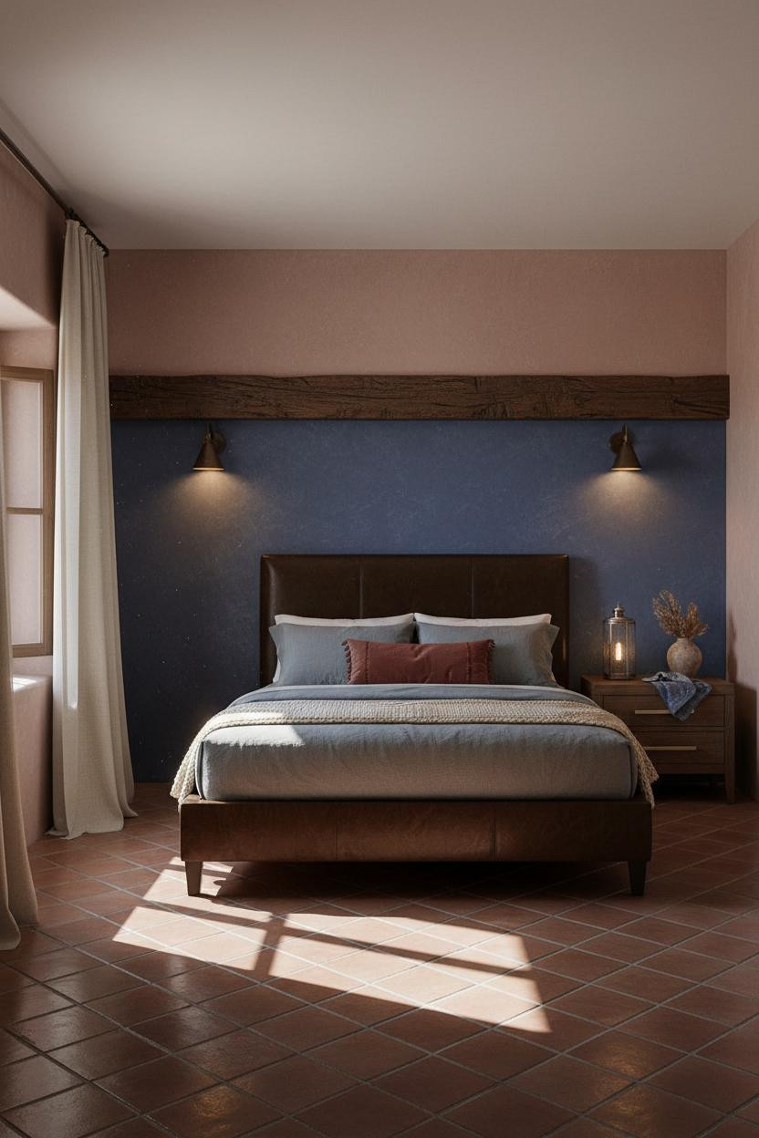


The half-height wainscoting in deep indigo clay plaster, capped by a dark hand-hewn timber rail, grounds the whole room in a way that full-wall color alone never does.
Why it holds together: The horizontal band created by that thick timber rail gives the eye a place to rest, so the unglazed Saltillo tile floor and the clay-rose plaster above it can coexist without competing.
Avoid this mistake: Don't swap the timber cap for a thin molding strip. The weight of that rail is the whole point.
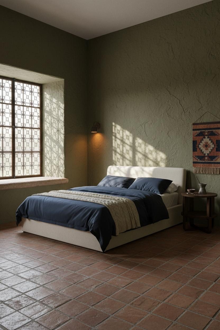
Indigo Walls and Iron Windows: a Room That Feels Ancient
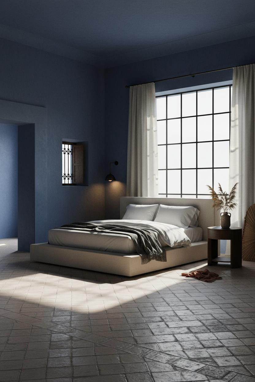


I keep coming back to this one. The room feels calm and cohesive in a way that deep color usually fights against.
What makes it work is the forged iron window grid dividing the wall into geometry. The shadow bars it throws across the indigo-washed plaster actually animate the surface, so the color reads layered rather than flat.
The easy win: Cream linen curtains on a wrought-iron rod, pooled at the tile floor. Nothing too precious. Just enough softness to keep the iron from feeling cold.
Olive Plaster and Colonial Iron: the Combination I Didn't Expect to Love

This one is divisive. Deep olive-moss plaster with iron-grilled windows reads serious at first glance.
But the hand-troweled chisel marks in the wall surface catch raking light in a way that makes the color shift from mossy green to warm gold depending on where the sun sits. That live surface is why it doesn't feel oppressive.
What to borrow: The woven wall hanging in faded rust and indigo above the nightstand. It ties the warm and cool tones together while still feeling like something found, not purchased as a set.
Paneled Plaster Walls That Look Like They Cost a Lot More
The floor-to-ceiling plaster panels framed by dark timber molding strips make this feel like a room from a different era. In the best way.
Why it looks custom: The panels create a rhythm across the wall that flat plaster can't replicate, and the natural color drift from pale dust to deeper clay at the base gives depth without any painting technique.
In a room like this, the smarter choice is to lean into the materiality: an oversized hammered-iron mirror instead of art, a deep mustard wool blanket instead of a patterned duvet. Let the wall do the work.
Board-and-Batten in Espresso: Dark Wood Done Right

Honestly, full-wall dark espresso planks shouldn't work against forest green. But they do, because the aged board-and-batten grain catches diffused light across every plank edge, creating vertical rhythm that reads as texture before it reads as color.
Where people go wrong: Pairing a dark feature wall with a dark floor. The polished concrete underneath keeps this from feeling like a cave, reflecting just enough cool light back into the room while still feeling grounded.
The Arched Niche: a Quiet Altar in the Middle of the Room
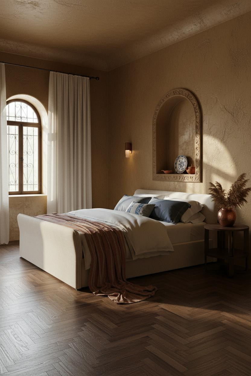
A recessed arched niche cut into dusty gold adobe plaster, fitted with a hand-carved timber surround, is the kind of architectural detail that makes a room feel genuinely old rather than old-inspired.
What gives it presence: The 24-inch depth creates a shadow pool inside the arch, so whatever sits in it (a folk ceramic, a terracotta lamp) looks displayed rather than placed.
And the aged walnut herringbone floor underneath ties it back to something warm, keeping the dusty gold walls from sliding into cold territory.
How a Single Arched Doorway Changes the Whole Atmosphere
Having a deep arched doorway in the left wall changes how you actually use the room. The thick pale ochre adobe plaster reveals cast a wedge of shadow into the arch interior, and that shadow geometry becomes part of the design.
Design logic: The arch works because the wall itself is thick enough to make it architectural rather than decorative. A thin drywall arch would look like a prop. This looks structural.
Steal this move: Lean a woven palm panel against the wall beside the doorway. It softens the hard geometry while keeping the earthy palette honest.
I Wasn't Expecting Raw Limestone to Feel This Warm
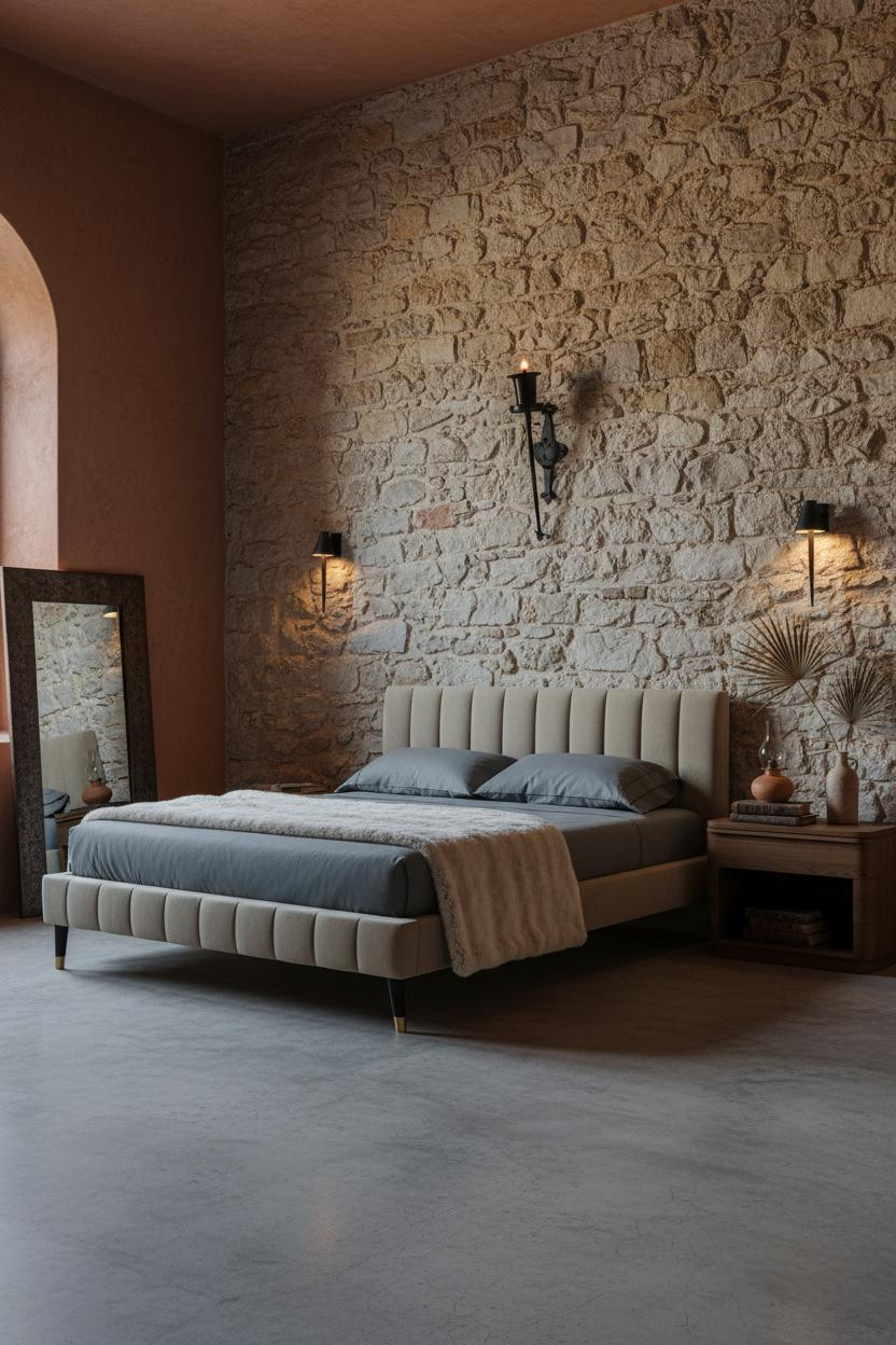

Rough-cut limestone blocks with irregular courses should feel austere. Somehow this one lands warm and lived-in instead.
The real strength: The warm adobe-rust plaster on the flanking walls is close enough in tone to the stone that the transition reads as natural variation rather than two different design decisions meeting in the middle. The room feels collected rather than assembled.
Pro move: A large hand-hammered iron mirror leaning against the side wall (not hung) keeps the scale right while still feeling like something that arrived, not something that was installed.
Burnt Sienna, Reclaimed Walnut, and an Arch That Does All the Work
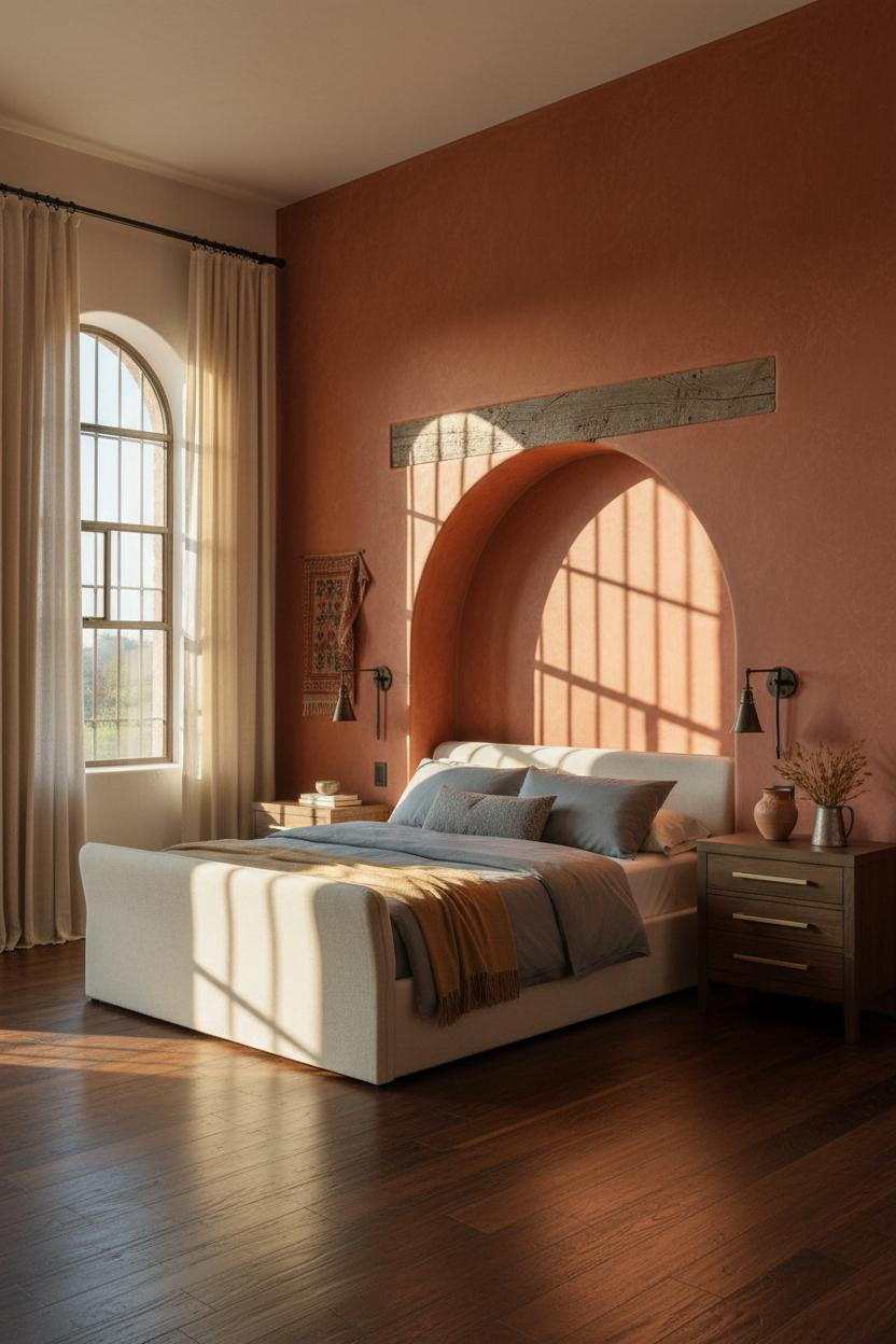
The arched alcove recessed into burnt sienna plaster is a strong geometric focal point even in a thumbnail. A rough timber lintel, raking light on the arch edge, warm shadow pooling inside.
Why the palette works: The burnt sienna wall and reclaimed dark walnut planks share enough red in their base tones that the room feels warm without being heavy, especially when the late afternoon light slants across both at once.
One smart swap: Replace a patterned duvet with slate jersey bedding and a single camel throw. Quieter bedding lets the architecture carry the room rather than competing with it.
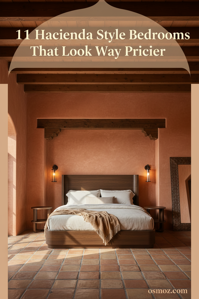
Exposed Timber Beams and Saltillo Tile: the Classic Combination for Good Reason
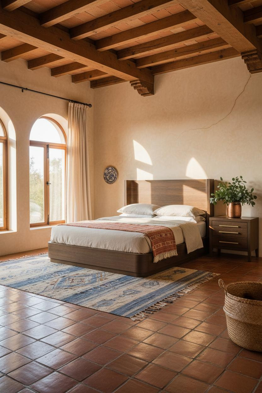
This is the room that made the hacienda look what it is. Not a trend. A logic.
The exposed chocolate-brown timber ceiling beams throw dramatic horizontal shadow lines down the ochre-washed walls, and the natural color variation in the Saltillo clay tile floor answers them from below. Two imperfect surfaces in conversation. That's why the room feels lived-in and intimate without any styling tricks.
What not to do: Don't add a geometric wool rug on top of Saltillo tile. The tile IS the texture. Let it breathe.
 Our #1 Pick
Saatva Classic Mattress
America's best-selling online luxury innerspring. 365-night trial, lifetime warranty, free white glove delivery.
Shop Saatva Classic
Our #1 Pick
Saatva Classic Mattress
America's best-selling online luxury innerspring. 365-night trial, lifetime warranty, free white glove delivery.
Shop Saatva Classic
The Foundation Of Every Beautiful Bedroom
Walls get replastered. Tile gets regrouted. The mattress stays. And in a room this considered, what you sleep on matters as much as what surrounds you.
The Saatva Classic fits that logic. Dual-coil support that holds its structure long after the walls around it have been repainted, a breathable organic cotton cover that doesn't trap heat, and a Euro pillow top that feels genuinely soft without losing its foundation. It's the kind of bed that makes you notice the difference the first night.
And honestly, in a hacienda bedroom built around things that age well, it belongs.

The rooms people save are the ones where nothing looks accidental. Start with the bed. The rest figures itself out.


