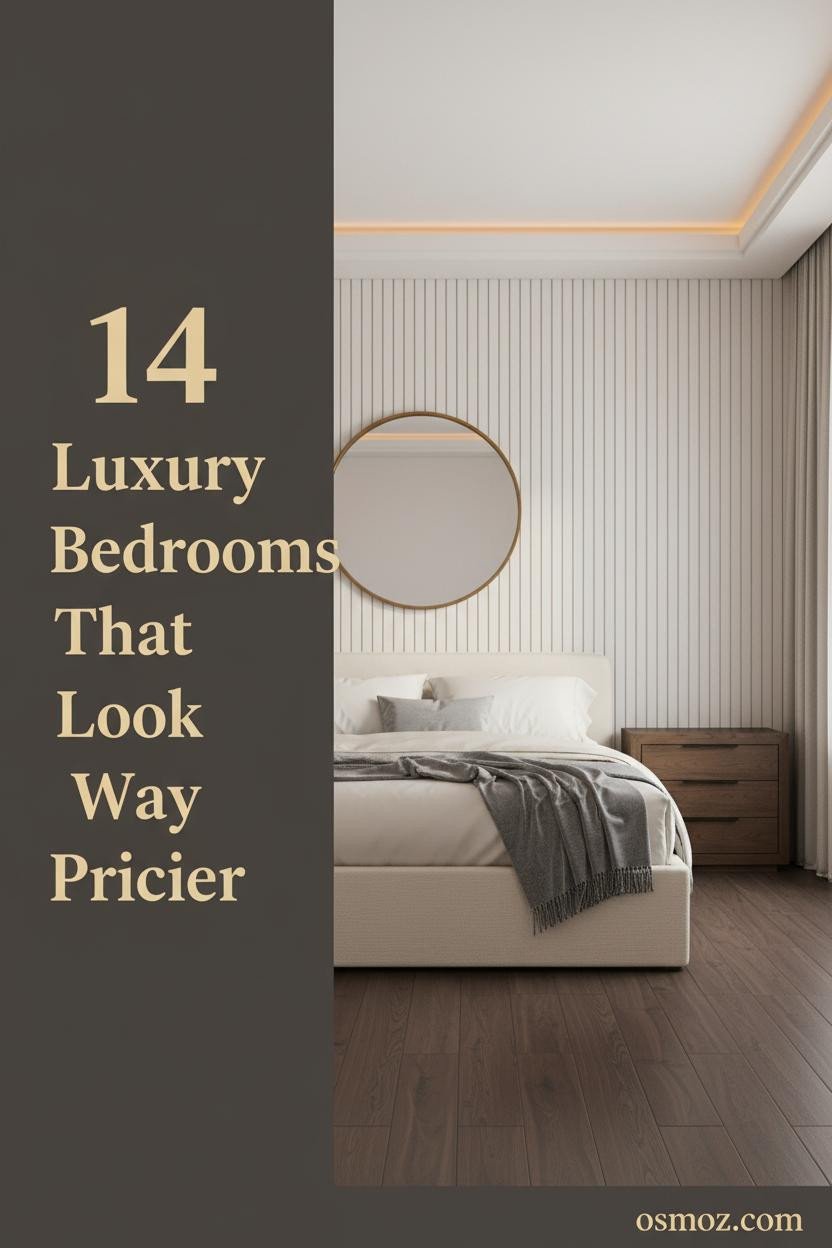
14+ Luxury Bedrooms That Feel Like You Never Have to Leave
22 may 2026The first thing you notice in the best expensive bedroom luxury designs isn't the furniture. It's the feeling that someone made a real decision in here, and then stopped.
These 14 rooms do that. Each one has a material, a move, or a detail worth stealing.
The Herringbone Wall That Makes Dawn Worth Waking Up For
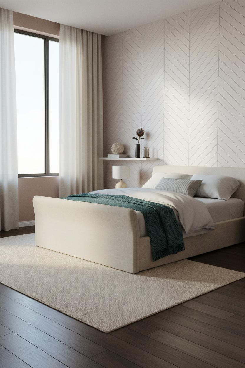

I keep coming back to this one. The Japandi restraint is easy to admire, but it's the material doing the real work.
Why it looks custom: Floor-to-ceiling herringbone white oak paneling catches raking morning light and casts fine shadow lines that shift across the wall all day, giving a flat surface genuine architectural rhythm.
Steal this move: Pair the oak with dusty rose plaster on the flanking walls. The warm-cool contrast is what keeps it from reading too rustic.
A Mushroom Plaster Wall That Earns Its Square Footage
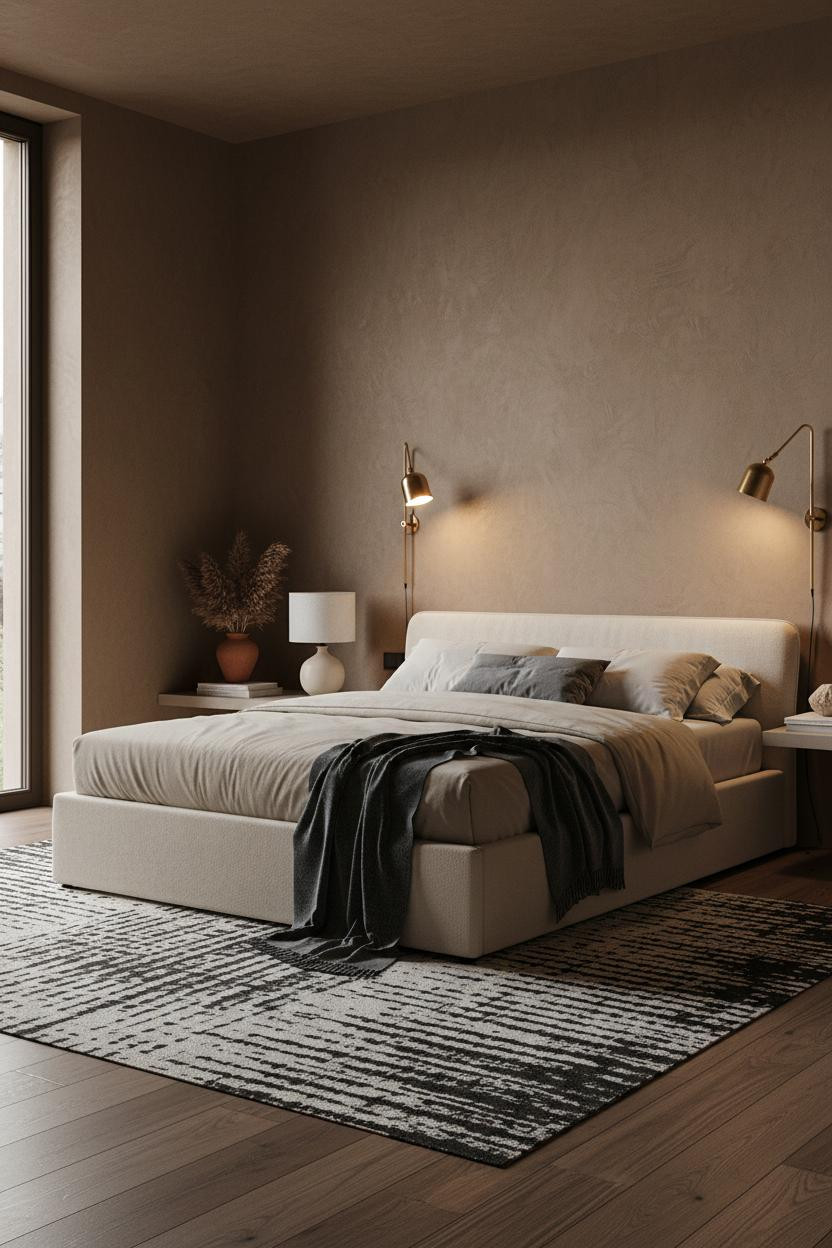
The room feels warm without being heavy. That balance is harder than it looks.
What makes it work: Hand-troweled textured plaster in deep mushroom absorbs and deflects light at the same time, so the wall reads as a real material, not just a color choice.
Layer a slate cashmere throw over oatmeal bedding and let one corner trail. That small imperfection anchors the whole composition.
Travertine at Twelve Feet Does Something Ordinary Stone Cannot
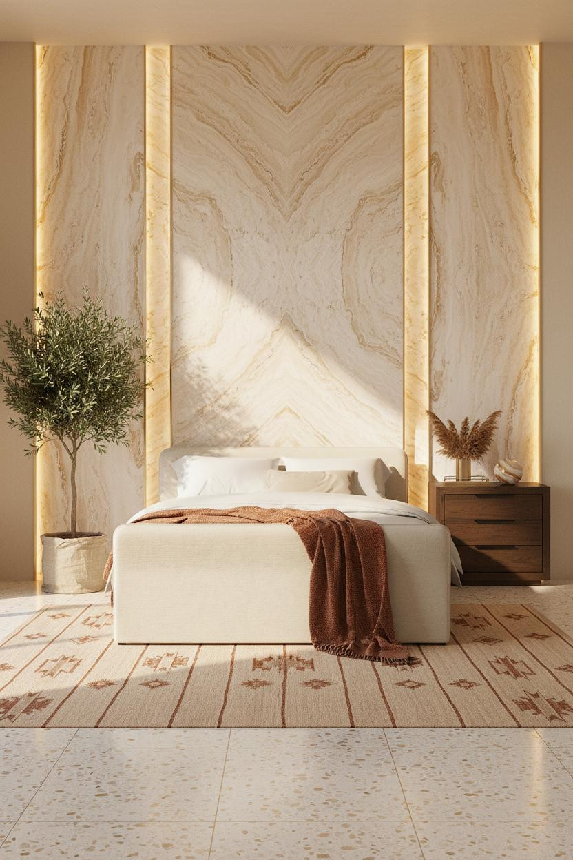
This one is divisive. Not everyone will commit to full-height stone. But the people who do never regret it.
A backlit panel of book-matched travertine reads as geological at this scale. The hidden LED cove traces the fossil lines in a way that changes completely between morning and evening.
The practical move: Ground the stone with a flat-weave kilim in sand and burnt sienna. It keeps the room from feeling like a hotel lobby.
Dark Bronze Lacquer That Makes Overcast Days Feel Intentional
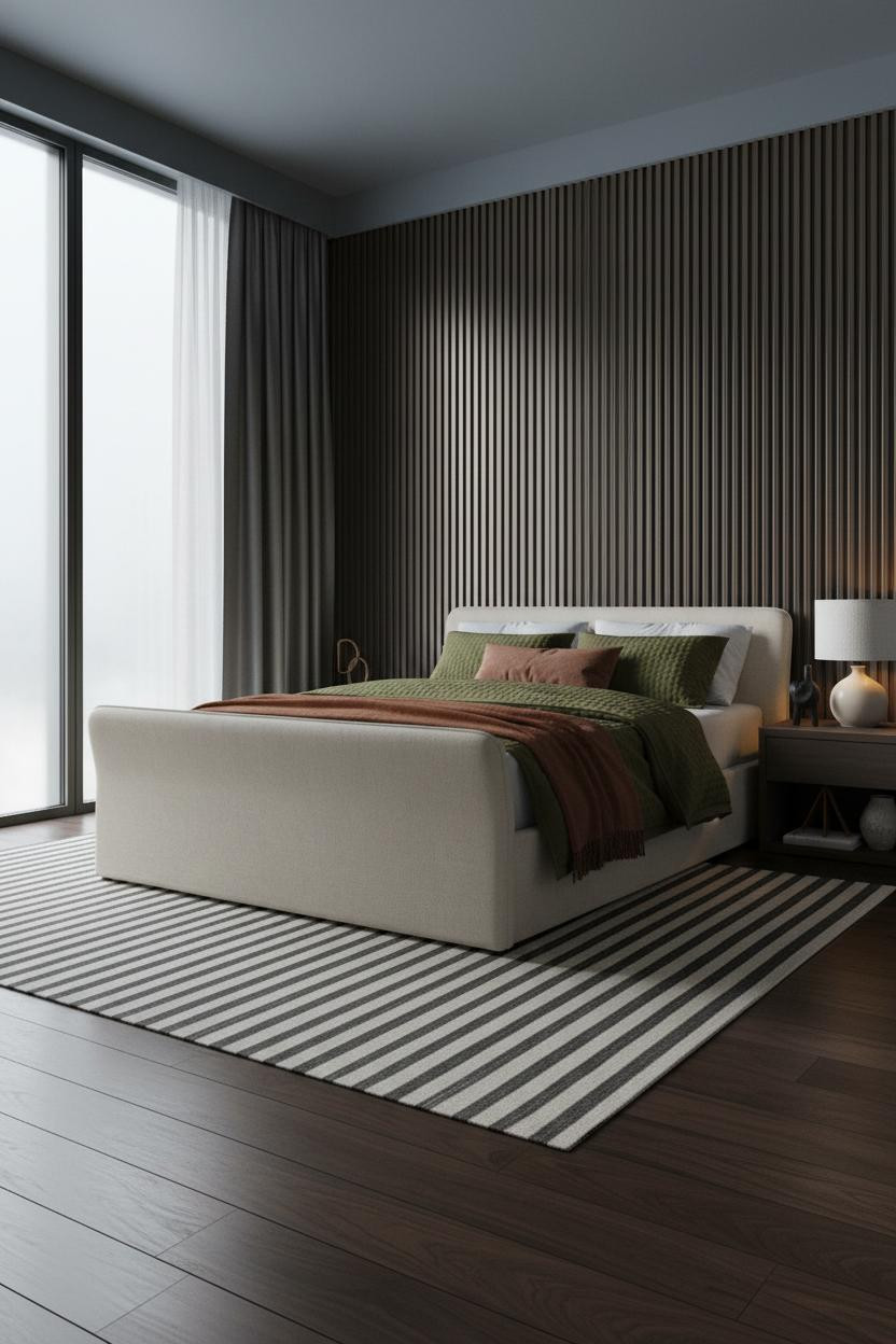
Most people avoid dark lacquer in a bedroom. I think that's a mistake.
In a room this moody, the real strength is the fluted dark bronze paneling: each vertical ridge catches flat overcast light and throws micro-shadows, so the surface has rhythm even when the sun doesn't cooperate.
Avoid this mistake: Don't fight it with warm accessories. Lean into charcoal curtains and an olive waffle-weave throw. Let it be dark.
Coffered Ceilings Are Underrated and This Room Proves It
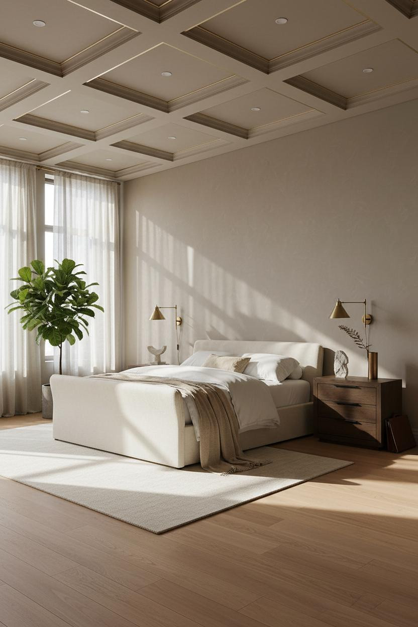
Honestly, the ceiling is doing as much work as the bed in this room. Maybe more.
Design logic: A coffered ceiling in greige plaster with brushed champagne gold trim draws the eye upward and makes the whole room feel taller, which helps the honey oak flooring breathe instead of feeling low and cramped.
Worth copying: Keep the walls pale and let the ceiling be the statement. One architectural move at a time.
The Charcoal Shelving Room That Makes You Want to Read More
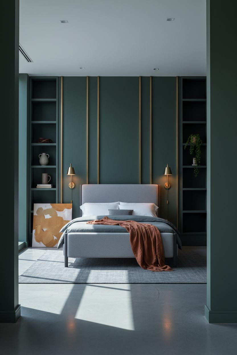
Having a floor-to-ceiling shelving wall in the bedroom changes how you actually use the room. It stops being just a place to sleep.
The deep charcoal lacquered shelving with recessed brass channels catches warm lamplight and makes the shelf objects feel curated (even when they aren't). Against forest green matte plaster, the whole wall reads as one composed surface.
The smarter choice: Keep the shelf objects sparse. A matte ceramic, a trailing fern, and one oversized canvas leaning at the base. Done.
Venetian Plaster Wainscoting That Tricks the Eye Into Seeing More
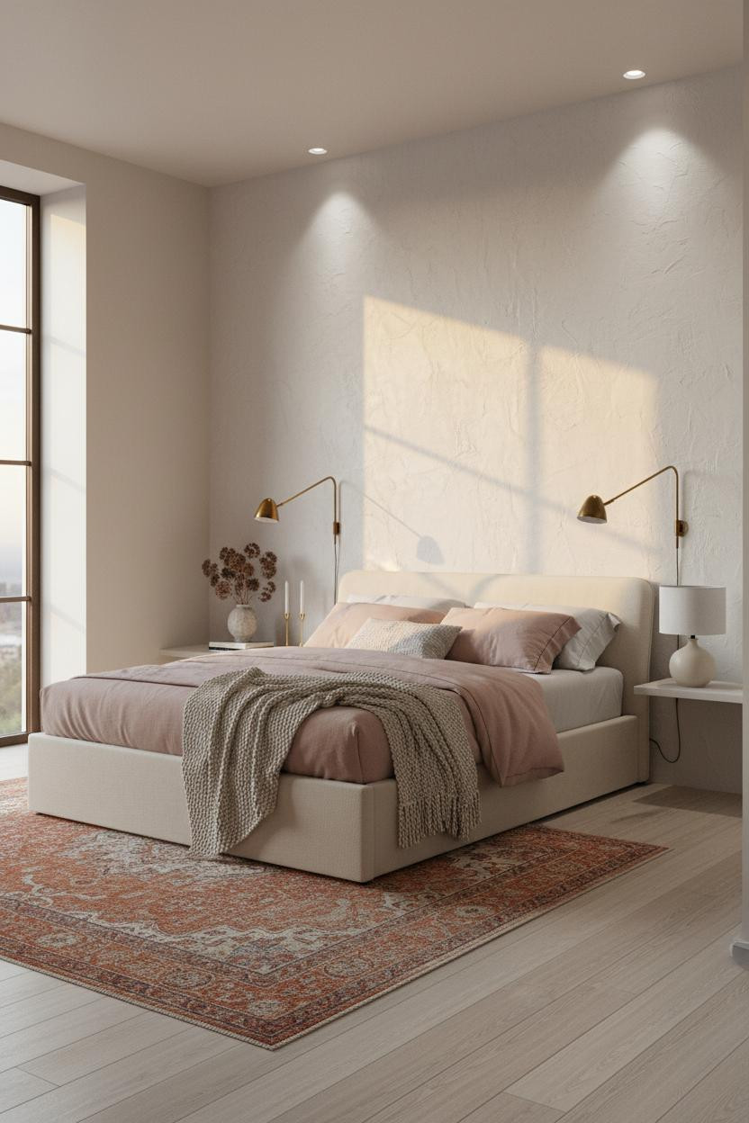
I almost scrolled past this. Glad I didn't.
The reason it feels expensive instead of just well-decorated is the hand-troweled white Venetian plaster wainscoting: its surface catches raking sunset light and becomes almost tactile, giving the wall architectural presence that smooth paint physically cannot.
Pro move: Layer dusty pink linen bedding with a cream chunky-knit throw and pair brass sconces low on the wall. The warmth stacks at the right height.
Slate Blue Board-and-Batten That Earns the Silence
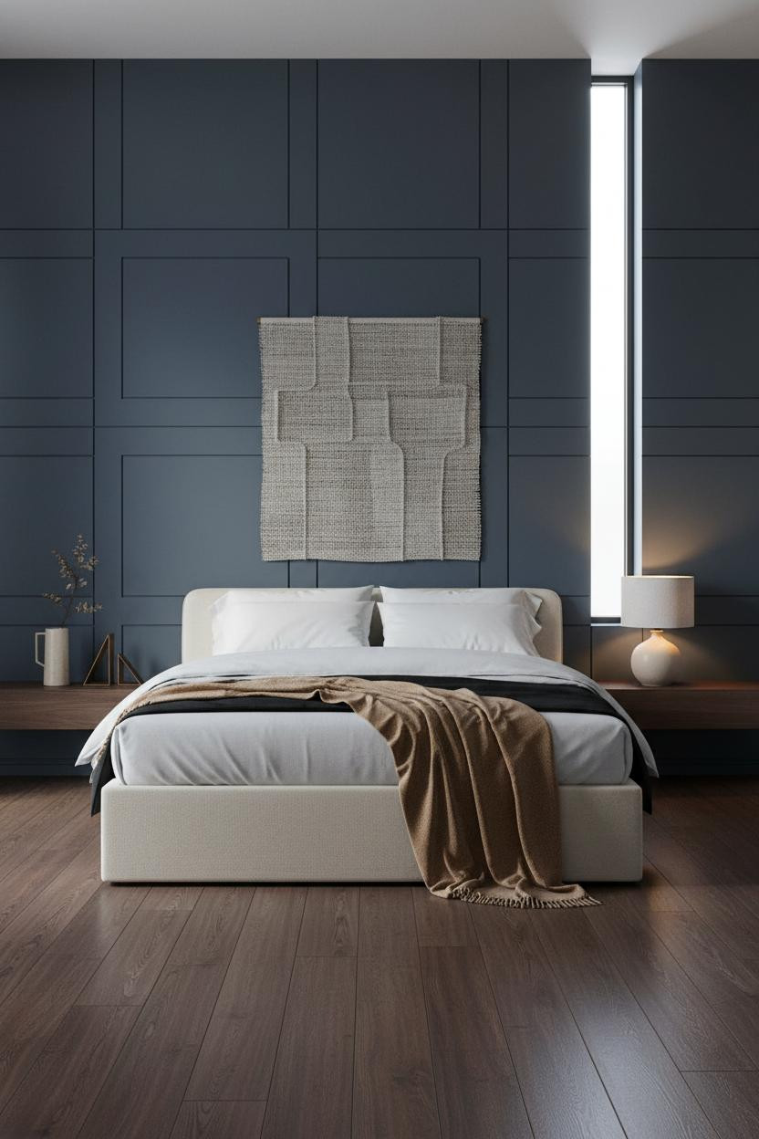
Nothing fancy. That's the point.
What gives it presence: Floor-to-ceiling board-and-batten in deep slate blue-grey lacquer, with shadow gaps between each panel, creates a graphic grid that reads as architectural without a single ornamental detail.
Skip the area rug and let the dark walnut flooring run bare. The contrast between the cool wall and warm floor grain does the work a rug would cover up.
Fluted Oak and Sage Plaster: The Alpine Room I Think About Weekly
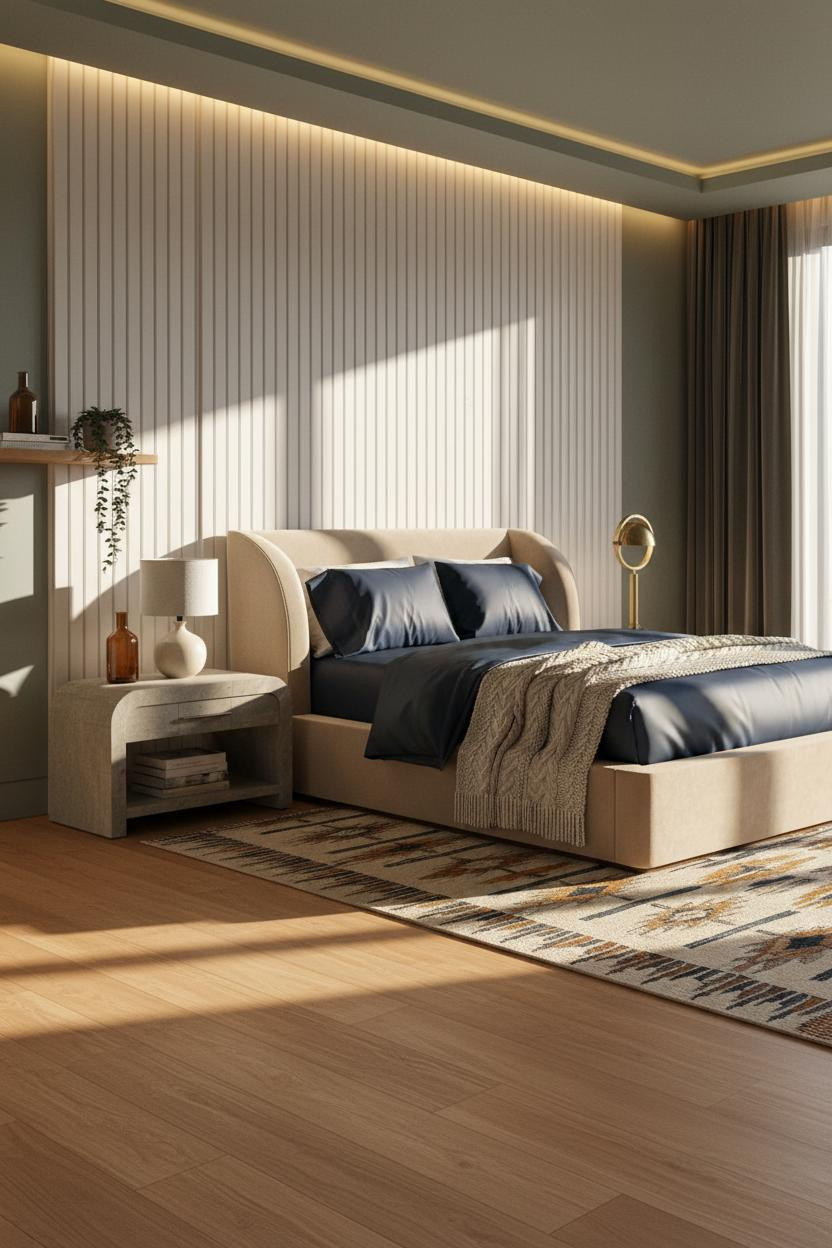
This is the kind of room that makes you want to cancel your plans for the evening.
Why the palette works: The fluted white oak paneling catches late-afternoon raking light in a way that makes every vertical groove cast its own shadow, while the sage grey-green plaster on the flanking walls keeps the warmth from tipping into cabin territory.
The finishing layer: Navy sateen bedding with a cable-knit cream throw bunched casually at the footboard. Just enough contrast to keep things interesting.
Forest Green Marble Meets Dark Feminine Energy
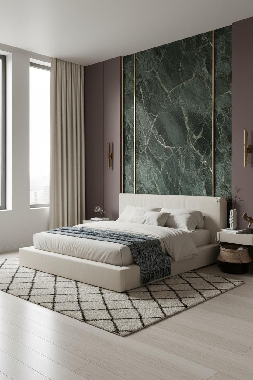
Fair warning. This room commits fully and it doesn't apologize for it.
A twelve-foot curved partition of deep-veined forest green marble with integrated brass channel recesses catches diffused light and throws thin gilded lines across the stone surface. It shouldn't feel residential. But somehow it does.
What not to do: Don't soften the scheme with warm neutrals. Pale birch flooring and a Moroccan ivory rug are all the contrast this room needs.
The Arched Niche That Makes the Bed Feel Like a Destination
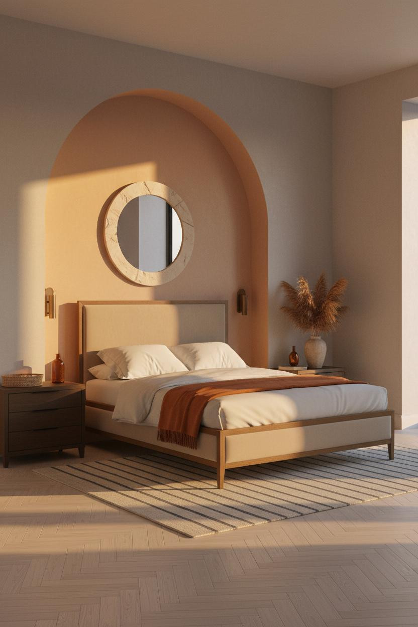

Scale and proportion are the real design skill. This room is the proof.
Why it feels intentional: An eleven-foot arched niche in warm clay matte plaster creates a gradient from amber at the crown to deep ochre at the baseboard, making the bed zone feel private in a way that four flat walls never achieve.
A burnt orange mohair throw draped asymmetrically at the footboard corner echoes the arch's warmth. Nothing needs to match exactly.
Deep Charcoal Venetian Plaster With a Round Brass Mirror Above
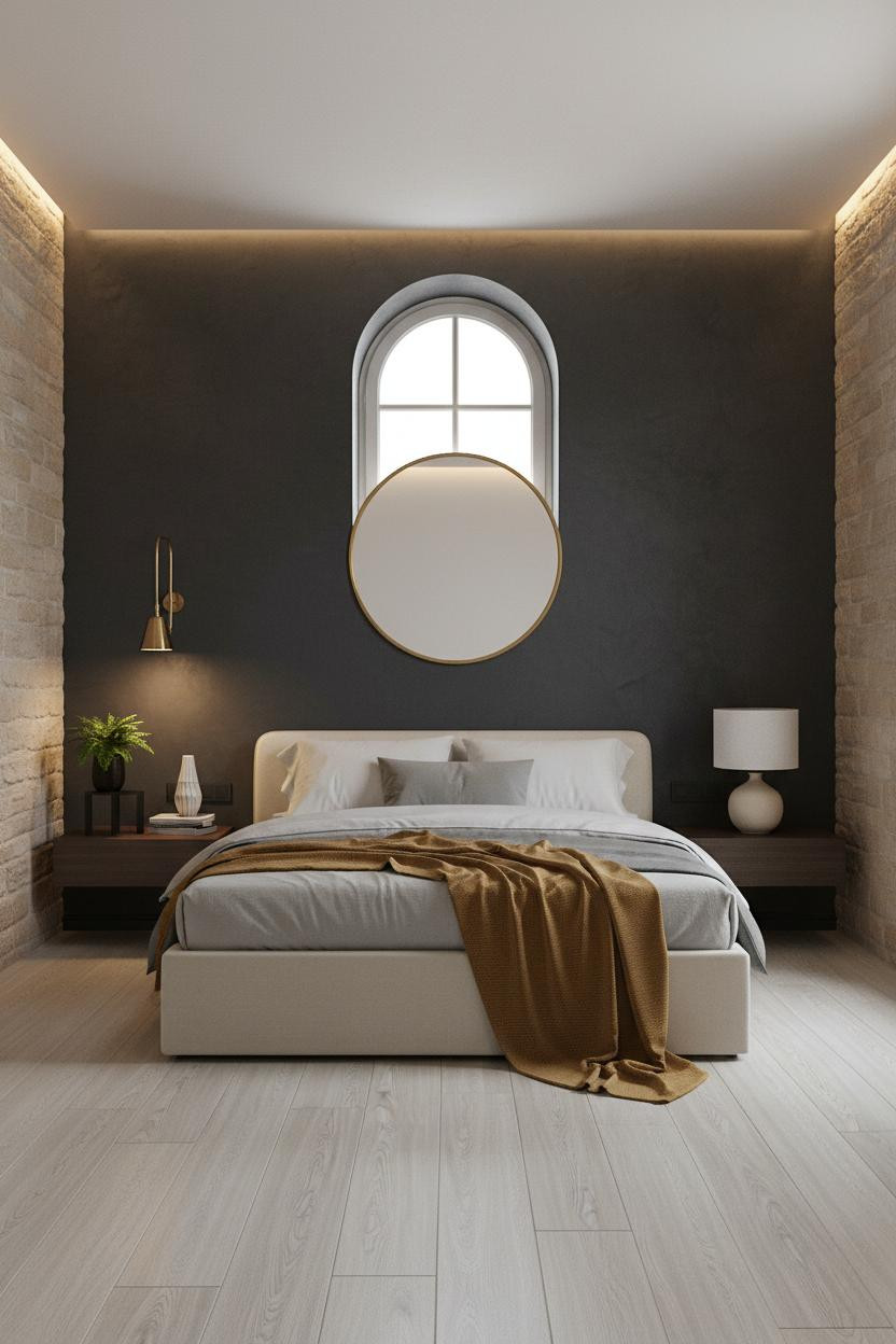
The room feels collected rather than decorated. That's the line most people miss.
What carries the look: Eleven feet of deep charcoal Venetian plaster catches tonal shifts in diffused light the way still water catches the sky, making the flat surface look different at every hour of the day.
One smart swap: Replace a standard headboard mirror with an oversized round brass mirror. The circular form against a rectangular wall creates just enough tension to feel designed.
Navy Walls and Built-In Shelving That Make Night the Best Part
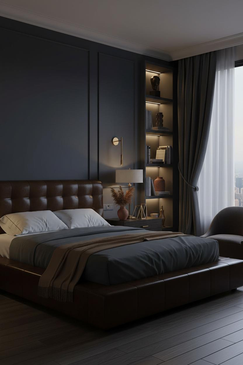

Bold choice. Not for everyone. But the payoff after dark is real.
The deep navy lacquered shelving with integrated brass channel lighting absorbs ambient fill light and lets the brass glow define the room's mood entirely. The shelf objects (a bronze torso, architectural vessels, oversized art books) read as sculpture at night, not storage.
The easy win: A camel throw draped off one side of the mattress pulls warmth into an otherwise cool scheme. One warm element is enough.
Floor-to-Ceiling Sheers With Brass Hardware Do More Than Block Light
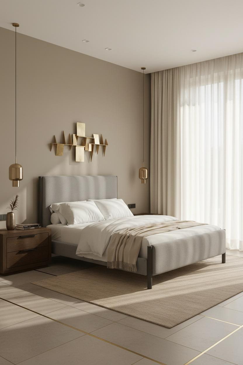
This is what proportion done right actually looks like. And it starts at the ceiling.
Why it feels expensive: Pleated ivory linen sheers hung at full ceiling height with brushed brass hardware draw the eye all the way up, making the room feel taller while still filtering light softly across the warm greige plaster headboard wall.
Where to start: Hang curtain rods at ceiling height, not window height. It's the single cheapest way to make a room look more considered than it actually is.
 Our #1 Pick
Saatva Classic Mattress
America's best-selling online luxury innerspring. 365-night trial, lifetime warranty, free white glove delivery.
Shop Saatva Classic
Our #1 Pick
Saatva Classic Mattress
America's best-selling online luxury innerspring. 365-night trial, lifetime warranty, free white glove delivery.
Shop Saatva Classic
The Foundation Of Every Beautiful Bedroom
Walls get repainted. Plaster gets refinished. The bed stays. And in a room this considered, what you sleep on matters as much as what you look at.
The Saatva Classic fits that standard. Dual-coil support holds structure through the night, the Euro pillow top gives you softness that doesn't flatten out, and the organic cotton that breathes means you actually sleep cool in a room designed to feel warm.
Build the room around the details. Start with the bed.

The rooms people save are the ones where nothing looks accidental. Every material choice in these 14 rooms was a decision, not a default. That's the only formula that holds up.


