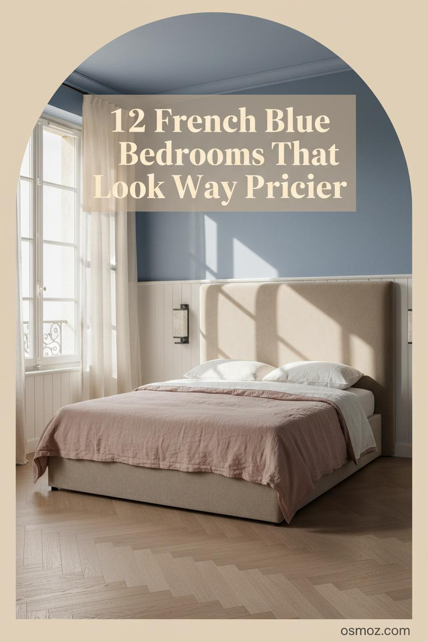
12+ French Blue Bedrooms That Feel Collected Rather Than Decorated
23 april 2026The best French blue bedroom ideas don't announce themselves. They just feel right the moment you walk in.
Collected, not decorated. That's the difference. These twelve rooms show exactly how to get there.
Cottage Paneling That Makes Blue Feel Grounded
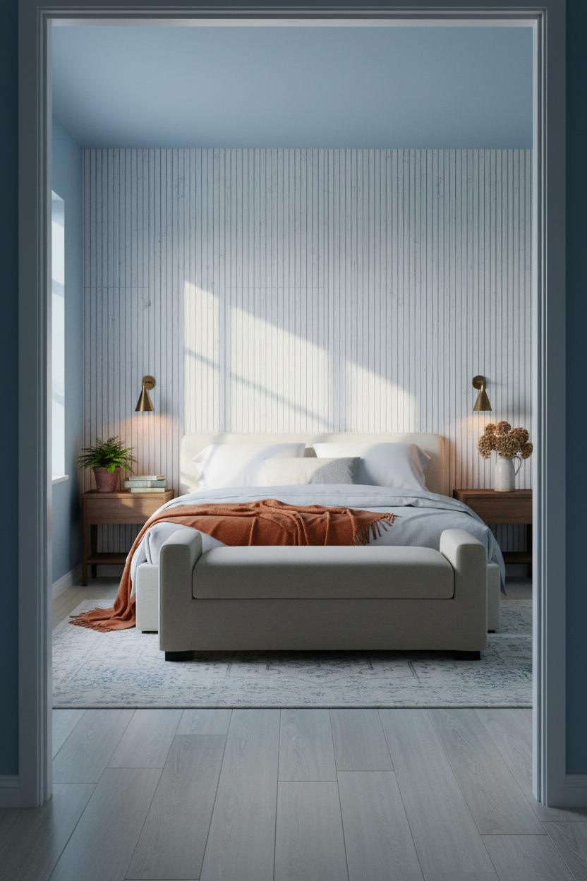

I keep coming back to rooms like this. Something about the proportions just works.
Why it holds together: The vertically slatted white paneling gives the cornflower walls something to push against, so the blue reads calm rather than cold.
Steal this move: Pair the paneling with a burnt orange mohair throw at the foot. One warm accent is all it needs.
Built-In Shelving That Earns Its Place
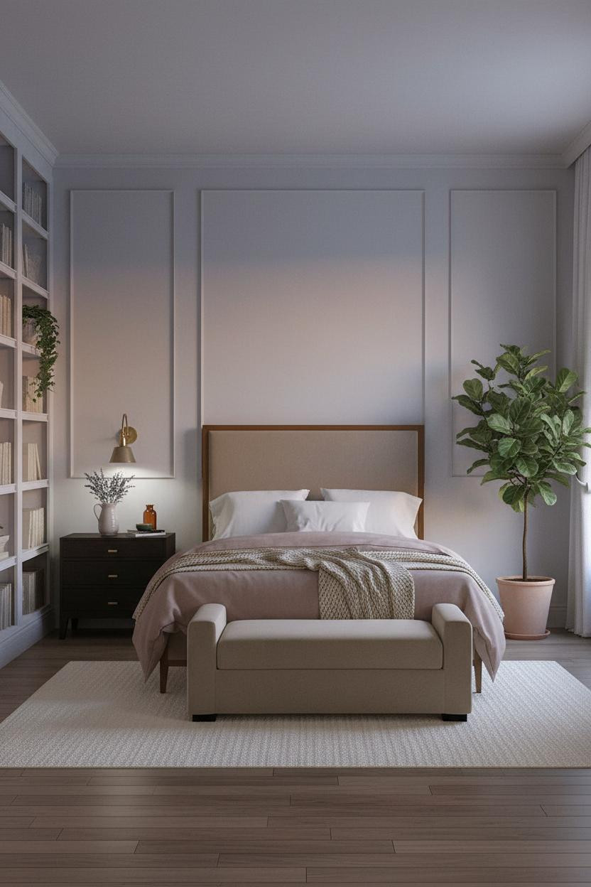

This is the room that converts people. Full-height shelving beside the bed hits different when the walls are periwinkle.
The aged chalky white shelving acts as a visual anchor, which keeps the warm maple floor from pulling everything too yellow. It's a quiet balancing act, and it works because the two finishes are far enough apart on the warmth scale to create real contrast.
The practical move: Style the shelves loosely. Worn hardcovers, a trailing ivy, one ceramic vessel. Nothing too precious.
A Coffered Ceiling That Does Most Of The Work
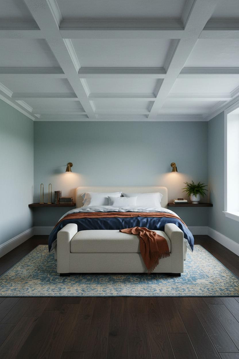
Honestly, the ceiling is doing more than most people realize in a room like this.
What gives it presence: The painted plaster coffered grid creates shadow lines that flat walls simply can't replicate, giving the sage-misted blue somewhere to breathe upward instead of sitting flat.
Avoid this mistake: Don't paint the coffers the same color as the walls. Keep the grid white. The contrast is the whole point.
The Arched Alcove You Can't Look Away From
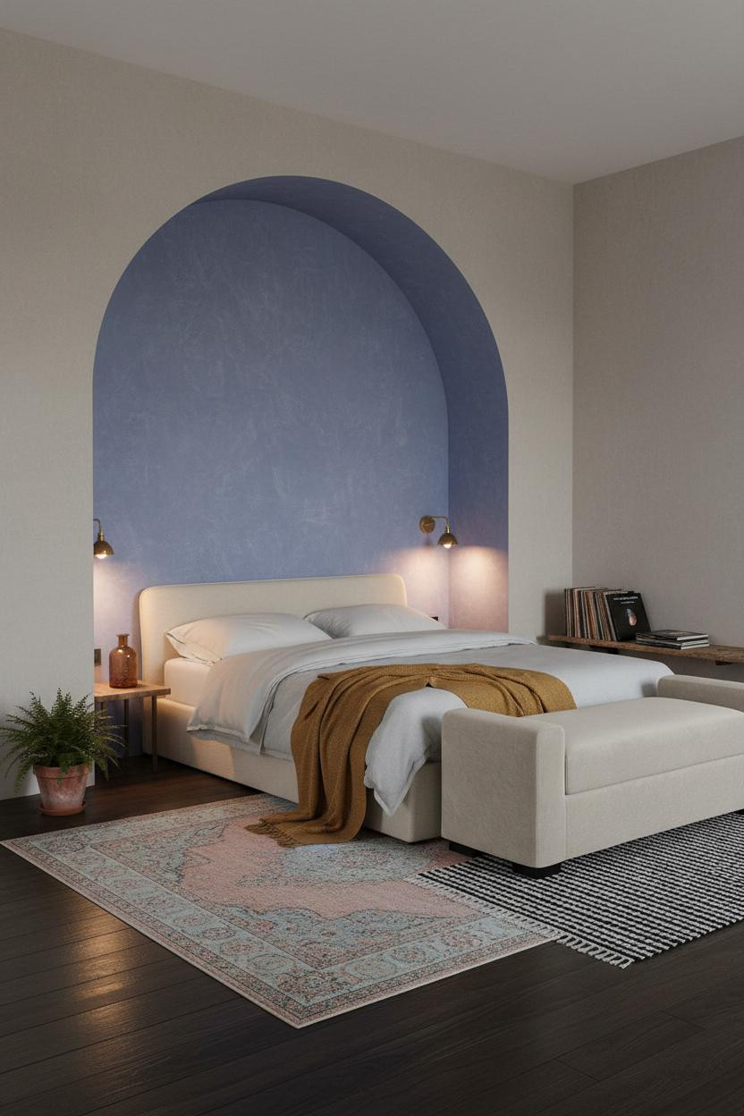
Bold choice. Not every room can carry a full-height arched alcove. But when the plaster is hand-troweled in periwinkle-violet, it stops being risky and starts being the whole reason you're in the room.
Why it looks custom: The curve of the arch frames the bed the way a doorway frames a view, so the furniture doesn't need to do anything complicated.
Worth copying: Layer a mustard wool blanket against the periwinkle. The warmth reads as intentional, not accidental.
Why A Crittall Window Changes Everything In Blue
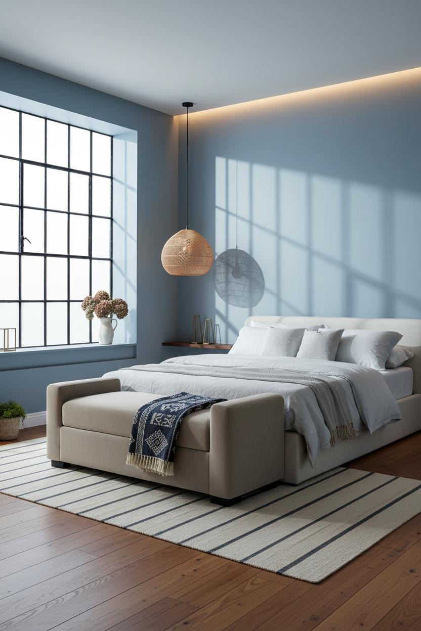
The slender black steel muntins of a Crittall-style window are the last thing you'd expect to soften a room. And yet they do, especially against cornflower walls.
Design logic: The sharp geometry of the window grid gives the eye a structured focal point, which lets the matte plaster walls read as calm rather than plain.
Hang a woven rattan pendant off-center above the foot bench. The organic material against all that steel is what keeps the room from tipping too industrial.
Denim Walls With The Right Amount Of Quiet
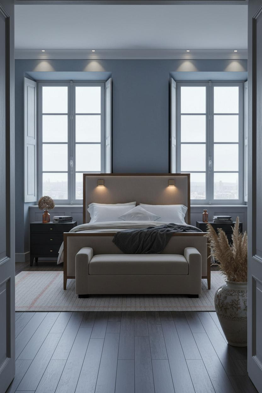
This is the version of French country blue I think people actually want but don't know how to name. Faded denim. Not sky, not navy.
Why the palette works: Faded denim plaster against aged white casement frames creates a Provençal calm, in a way that feels genuinely old rather than styled to look old.
The finishing layer: A charcoal cashmere throw draped at the foot grounds the softness without pulling the room into darker territory.
Periwinkle Walls And The Sash Window Secret
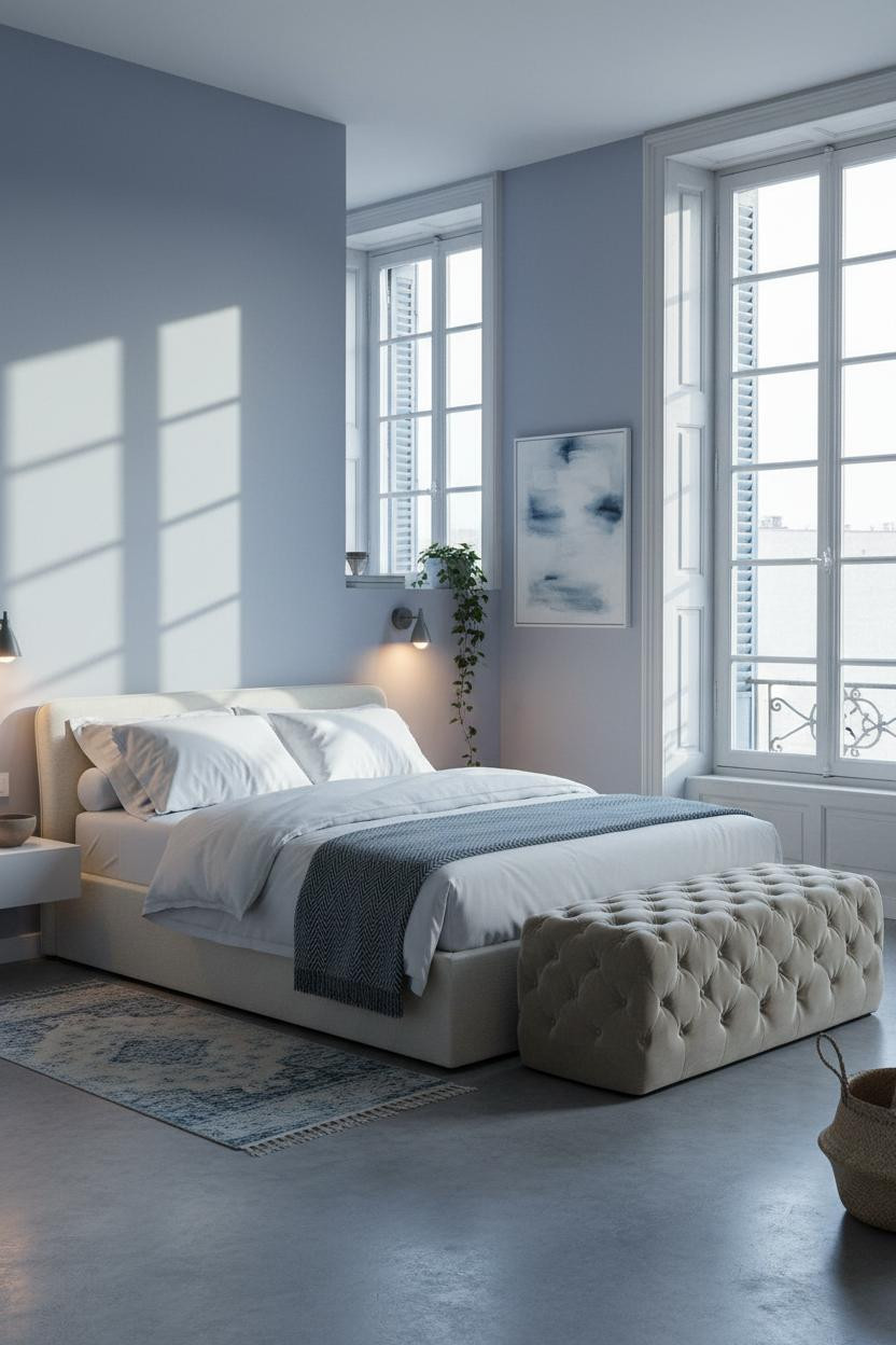
I almost scrolled past this one. Glad I didn't.
What makes this work: The tall sash windows throw rhythmic pane shadows across the periwinkle plaster, so the walls feel textured even though they're smooth. The room feels serene and luminous without a single pattern in sight.
One smart swap: Lean an oversized abstract canvas in washed blues against the wall instead of hanging it. It reads more lived-in that way.
Cobalt Walls Paired With Brass Hardware
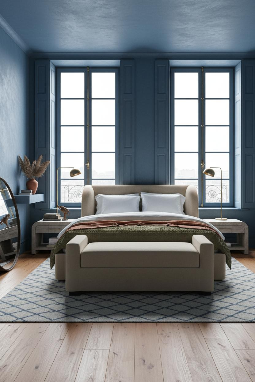

This one is divisive. Cobalt-washed plaster reads as almost too much until you see it with the brass swing-arm sconces lit at night.
Where the luxury comes from: The oxidized iron mirror leaning against the wall keeps the brass from feeling precious, while the Moroccan wool rug in indigo and cream pulls the two finishes into the same family.
What to copy first: A rust linen throw draped asymmetrically across the bench. Just enough warm contrast to keep the cobalt from going cold.
Wainscoting That Gives Blue Walls A Foundation
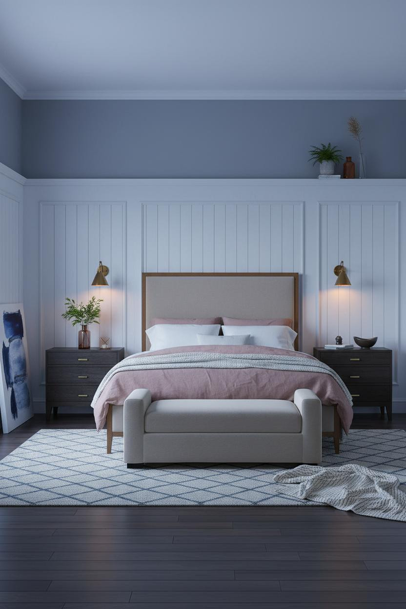
The room feels collected and intimate without trying to announce itself.
In a cottage bedroom like this, the smarter choice is running the board-and-batten wainscoting to two-thirds height so the slate-periwinkle plaster above gets room to breathe. Stop it short and the room just feels chopped. Go full wall and you lose the blue entirely.
What to borrow: A dusty pink linen duvet against the cool periwinkle. Sounds off. Isn't.
Exposed Brick That Works Because Of The Blue
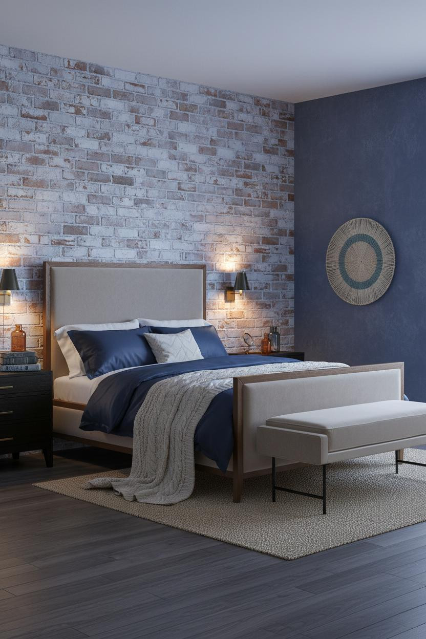
It shouldn't work. But periwinkle-washed brick against indigo plaster is somehow the most French thing in this entire article.
Why it feels balanced: The irregular mortar lines between bricks catch the diffused light and create depth, while the indigo walls on either side make the brick feel architectural rather than rustic.
Don't ruin it with too much contrast on the bed. A cable-knit cream throw half-fallen to the floor is all the relief it needs.
French Doors That Turn Afternoon Light Into Decor
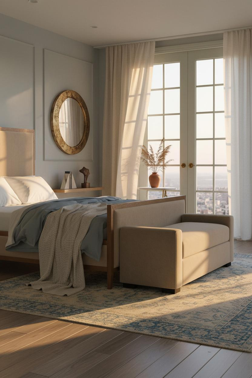
Having tall French doors in a powder blue bedroom changes how you actually use the room all afternoon.
Why it lands: The aged brass hardware against sage-green painted door frames pulls warm tones into a cool palette, so the powder blue walls read soft rather than faded.
The easy win: Hang a round aged brass mirror above the foot bench. It catches the afternoon light and doubles it. A small move with an outsized effect.
The Wainscoting Room I Think About Most
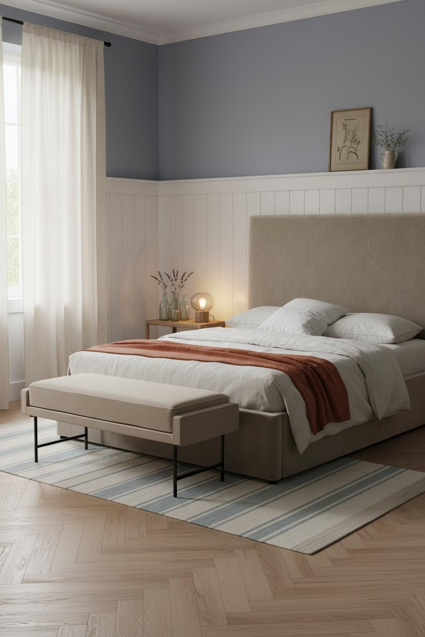
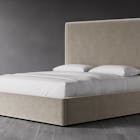
This is the one I keep coming back to. Admittedly, beadboard wainscoting isn't groundbreaking. But in a Provençal farmhouse bedroom with herringbone parquet flooring and dusty blue-grey walls above, it becomes something else entirely.
What creates the mood: The horizontal ridges of the whitewashed beadboard catch the raking morning light and throw fine parallel shadows up into the plaster, which is why the room feels warm even on a grey day.
The key piece: Floor-to-ceiling ivory linen curtains. Not panels. Full height. The soft blue bedroom look only works when the window treatment matches the room's unhurried scale.
 Our #1 Pick
Saatva Classic Mattress
America's best-selling online luxury innerspring. 365-night trial, lifetime warranty, free white glove delivery.
Shop Saatva Classic
Our #1 Pick
Saatva Classic Mattress
America's best-selling online luxury innerspring. 365-night trial, lifetime warranty, free white glove delivery.
Shop Saatva Classic
The Foundation Of Every Beautiful Bedroom
Walls get repainted. Linen gets swapped out. The mattress stays. And that's exactly where I'd spend the money first in any of these rooms.
The Saatva Classic is built on dual-coil support that holds up year after year, with a breathable organic cotton cover and a Euro pillow top that still feels right long after everything else in the room has been refreshed. It's the kind of mattress that makes a beautiful room feel like it was actually meant to be slept in.

The rooms people save are the ones where nothing looks accidental. But the rooms people actually want to live in? Those start with what you sleep on. Start with the bed. The rest figures itself out.


