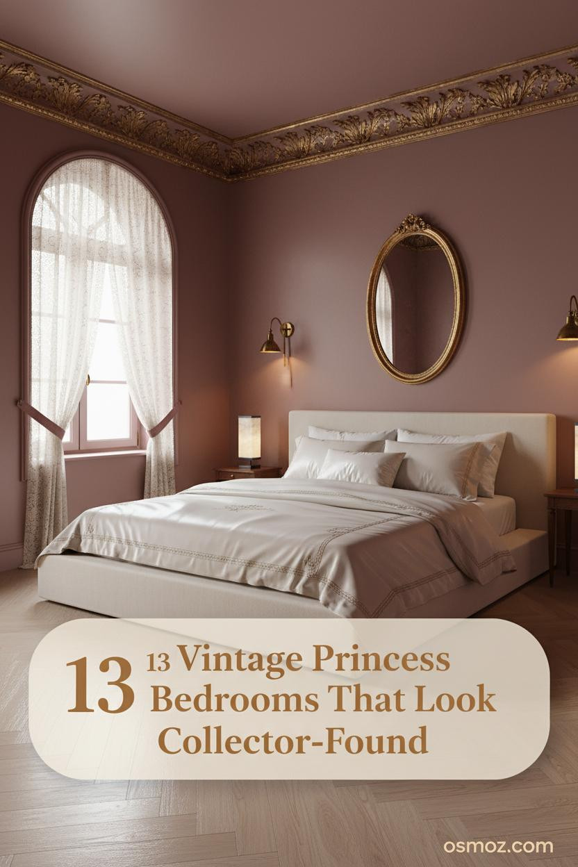
13+ Vintage Princess Bedrooms That Feel Collected Rather Than Costumed
31 march 2026Think your bedroom can't feel like a fairytale without tipping into costume. Vintage princess aesthetic bedroom design proves otherwise. The best ones feel inherited, not assembled.
These thirteen rooms sit somewhere between Bridgerton set and English country house. Collected. A little worn at the edges. Exactly right.
The Cornice That Changes the Whole Ceiling
I keep coming back to rooms where the ceiling does the heavy lifting.
Why it holds together: The hand-plastered cornice with faded gilt vine relief pulls every other ornate detail into a conversation rather than a competition. The dusty rose-mauve walls below it stay quiet on purpose.
The part to get right: Run the cornice full perimeter or skip it entirely. A partial cornice looks like an afterthought.
Dark Walls That Still Feel Romantic, Not Heavy
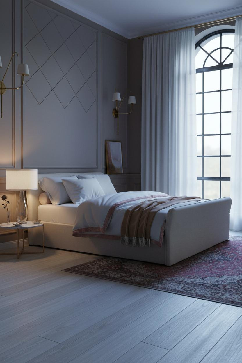


Fair warning. Charcoal walls in a bedroom ask a lot of you. But pair them with cream wainscoting and they deliver something rare.
The reason it feels romantic instead of oppressive is the slim-grid Crittall-style ironwork on the arched window wall. It breaks the dark mass into geometry. The sheer ivory silk panels soften that geometry just enough.
What not to do: Don't add warm wood tones here. The cool palette is the whole point. Let the brass sconces do the warmth work.
When Corinthian Pilasters Make the Room
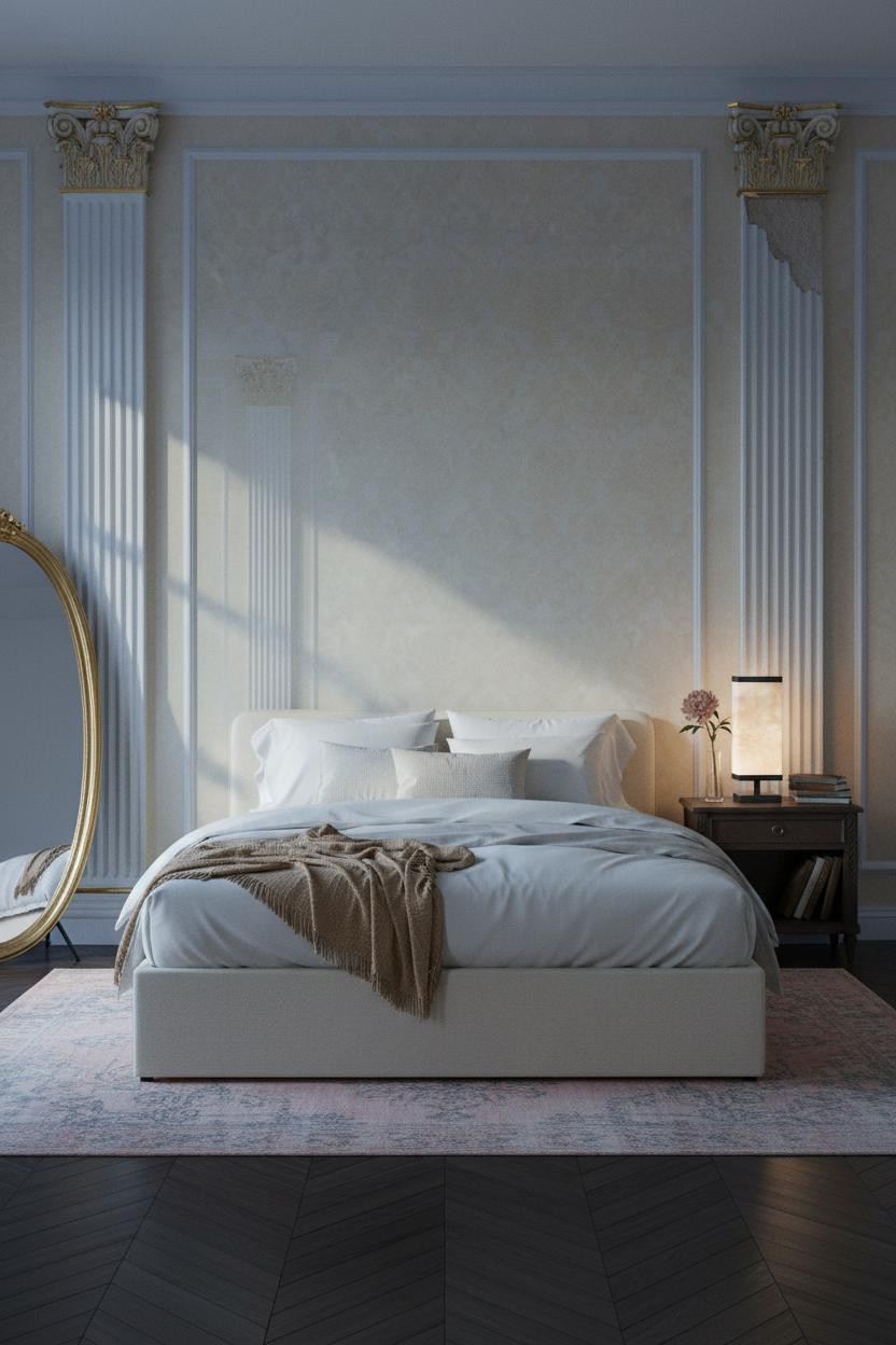
Baroque shouldn't work in a bedroom. Too grand, too formal. This one makes me reconsider.
Why it looks custom: Fluted Corinthian pilasters rising floor to ceiling flank the bed wall, and the slightly chipped gilt at one capital keeps it from feeling like a stage set. That one flaw is doing a lot of work.
Pro move: Lean an oversized oval mirror against the far wall to bounce those pilaster shadows. It doubles the room's sense of depth without adding a single architectural element.
Rococo Wainscoting Is Underrated and I Stand by That
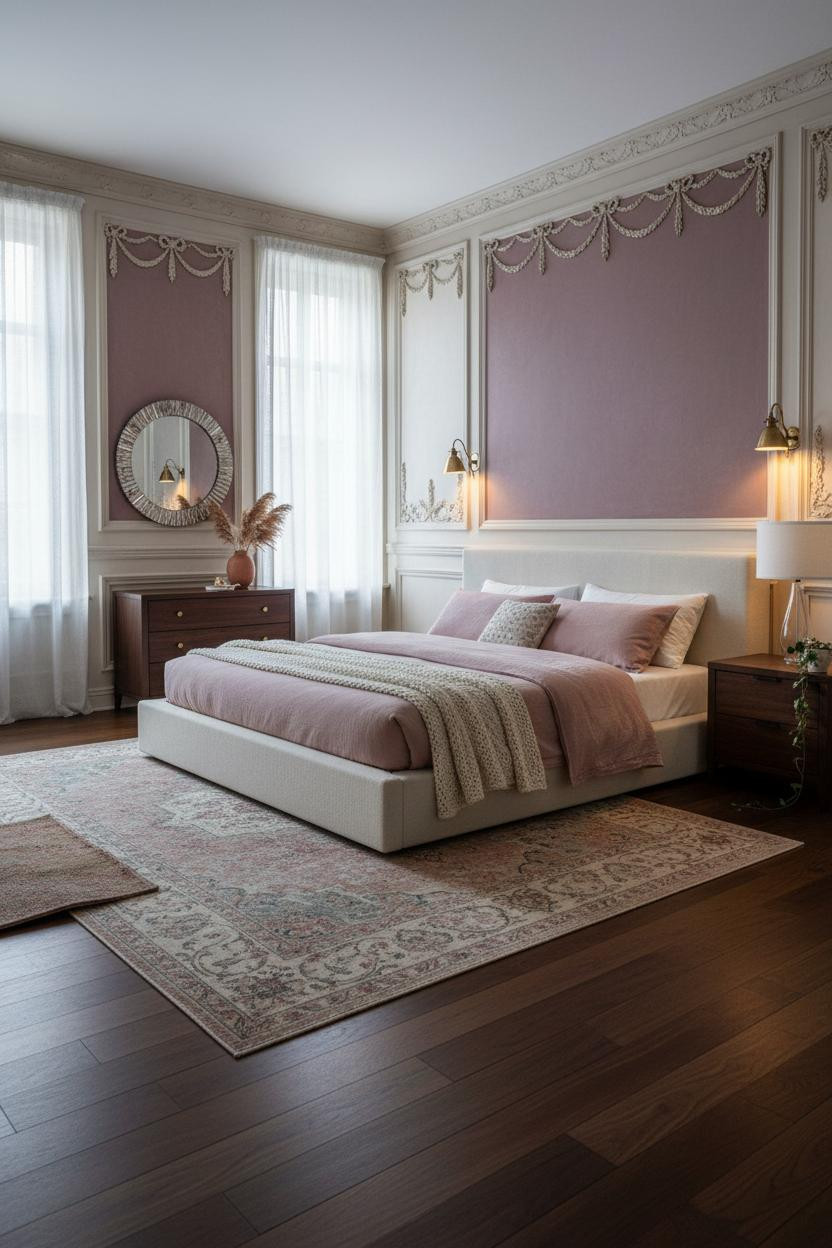
The combination of deep rose-plum walls above aged cream wainscoting is honestly one of the most underused pairings in feminine bedroom design.
In a room like this, the smarter choice is running the hand-carved ribbon-and-bow wainscoting full perimeter, not just behind the headboard. Every wall becomes part of the story. The antique brass sconces amplify that warmth on each side without competing with the carving.
Avoid this mistake: Don't match the wainscoting paint to the ceiling. Keep the ceiling a half-shade warmer so it stays intimate.
A Barrel Vault Ceiling for the Committed Romantic
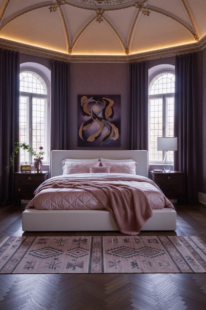
This one is divisive. Deep plum walls plus a gilt barrel vault ceiling is a lot.
But the people who commit never look back, and here's why: the aged cream plaster vault traced with gilt filigree relief becomes its own canopy above the bed. The room feels enclosed and theatrical, which is exactly the point of a princesscore bedroom.
What to borrow: The kilim runner in muted rose and charcoal grounds the dark walls without trying to brighten them. Don't fight the mood. Work with it.
Built-In Shelving That Earns Its Place
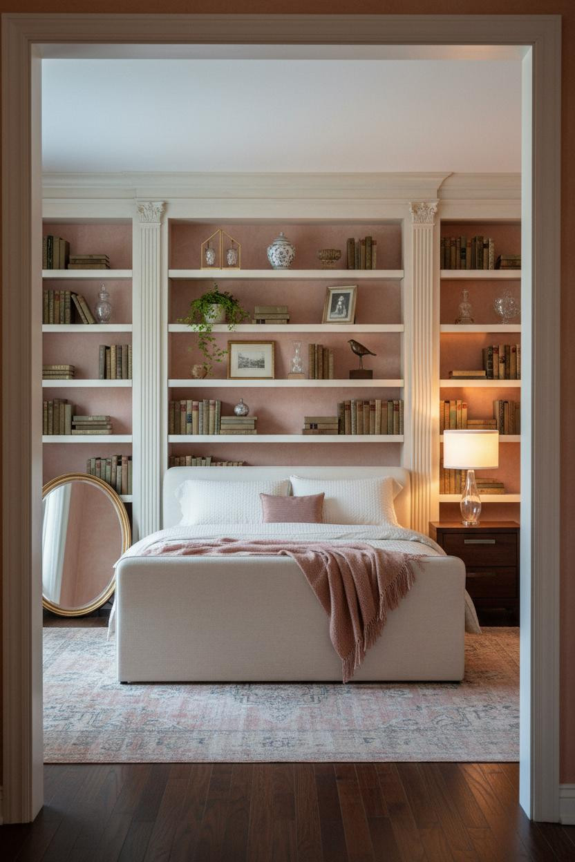
Having a full-width bookshelf wall flanking the bed changes how the room feels to be in, not just how it looks in photos.
What gives it presence: The fluted pilasters in aged cream paint break the shelf mass into rhythmic verticals, so it reads architectural rather than just storage-heavy. Gilt spines and porcelain on every shelf keep the vignettes from looking sparse.
Lean a round mirror with a tarnished gold leaf frame against the left shelf column. The easy win in a room this layered is giving one element room to breathe.
A Plaster Alcove That Turns the Bed Into a Throne
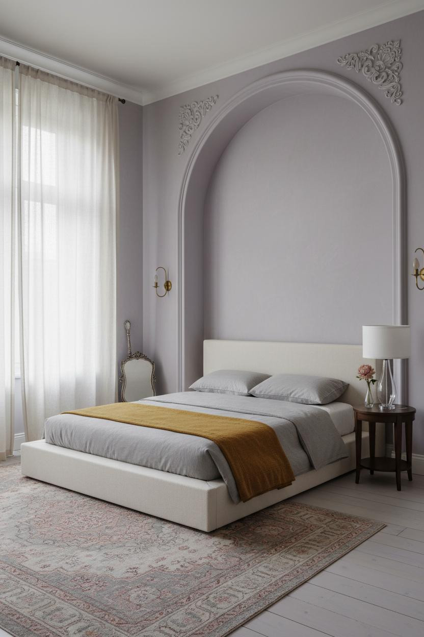
Nothing framing the bed makes it disappear into the room. An arched plaster alcove does the opposite.
Design logic: The curved edges traced in hand-applied gesso relief with foliate motifs create a niche that feels carved from the building itself, while the dusty lavender-grey walls make it intimate rather than imposing.
Try this: Hang floor-to-ceiling ivory sheers with embroidered edge trim on either side. The curtains soften the alcove boundary in a way that feels layered, not architectural.
Board-and-Batten That Actually Reads as Feminine
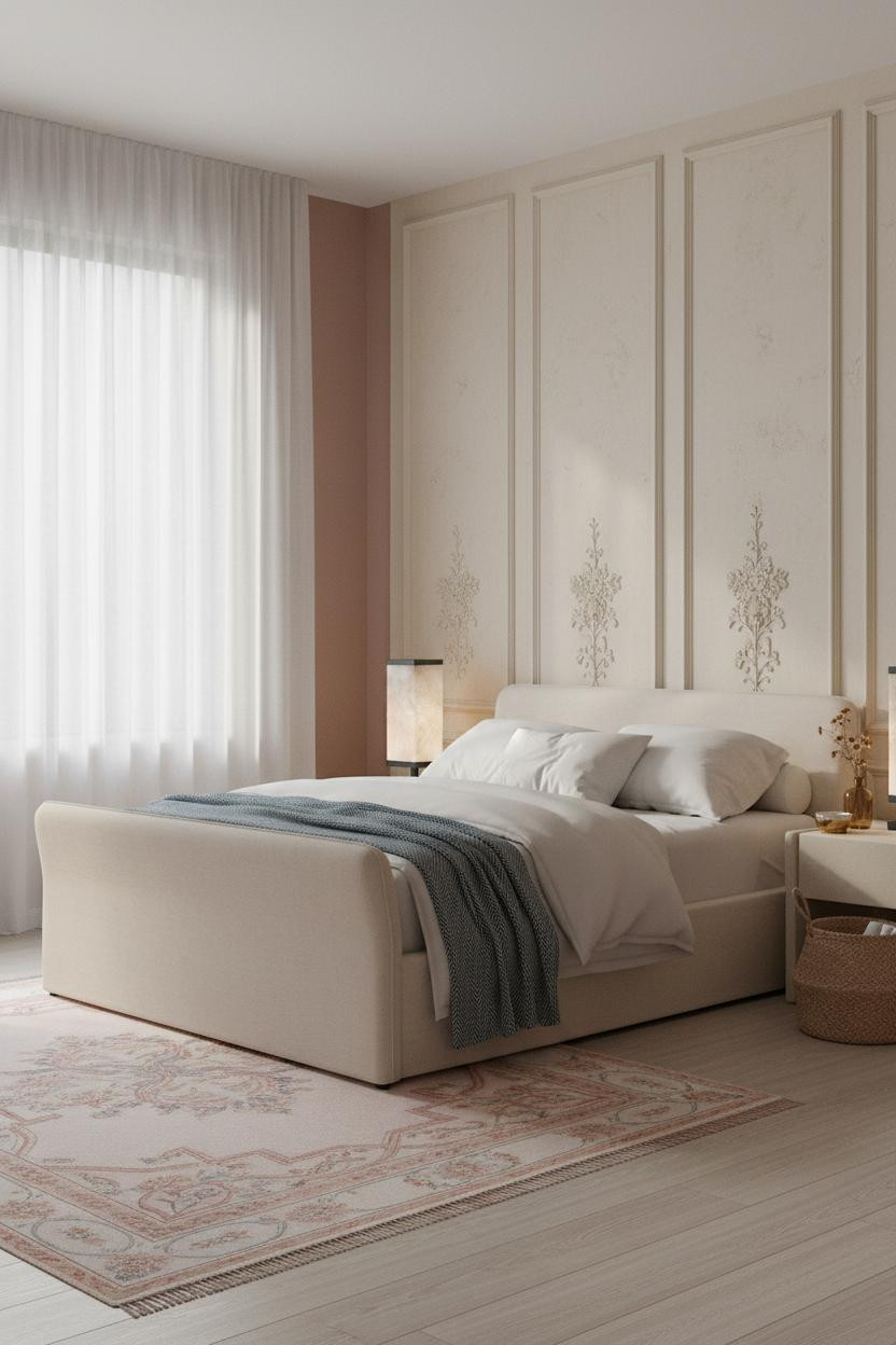
I almost dismissed this one as too cottagecore. Glad I looked closer.
What makes it work: The warm cream board-and-batten with barely-there raised floral relief between each panel keeps the wall texture from feeling flat, while the rose-blush flanking walls add enough color that the feature doesn't disappear. It's the right kind of quiet. The room feels powder-soft and lived-in, which is harder to pull off than it looks.
Victorian Indigo Walls With a Ceiling Worth Looking Up At
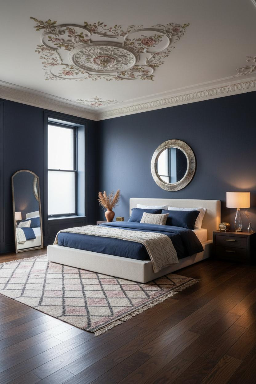
Deep indigo walls could make any room feel like a cave. What saves this one is looking up.
Where the luxury comes from: An ornate plaster ceiling medallion with hand-painted blush frescoes and gilded vine detailing draws your eye immediately, and the contrast against the dark walls makes it feel more dramatic than it would in a pale room. The room feels contained and ceremonial.
What cheapens the look: A matching indigo rug. The Moroccan diamond-pattern rug in muted rose and charcoal works because it adds pattern without repeating the wall color. Keep the floor lighter.
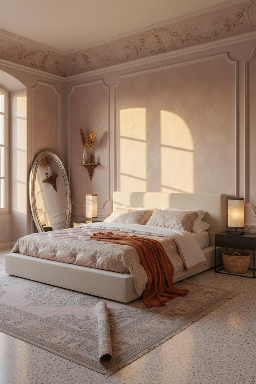
The Sunlit Palazzo Version of a Princess Room
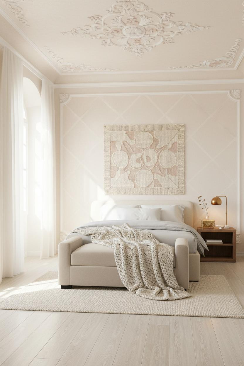
Most princess bedrooms lean dark and moody. This one goes the other direction entirely, and it works just as well.
Why it feels expensive: The champagne-ivory walls with faint raised trellis texture catch morning light across every surface plane, making the room feel luminous rather than blank. The ornate ceiling rose in pale blush overhead anchors the whole composition without adding weight.
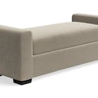
The finishing layer: A cushioned bench at the foot of the bed grounds the layout and gives the eye somewhere to land before it reaches the floor. A detail that's often skipped, and it shows when it is.
Burgundy Walls, Silk Canopy, and a Ceiling Worth Photographing
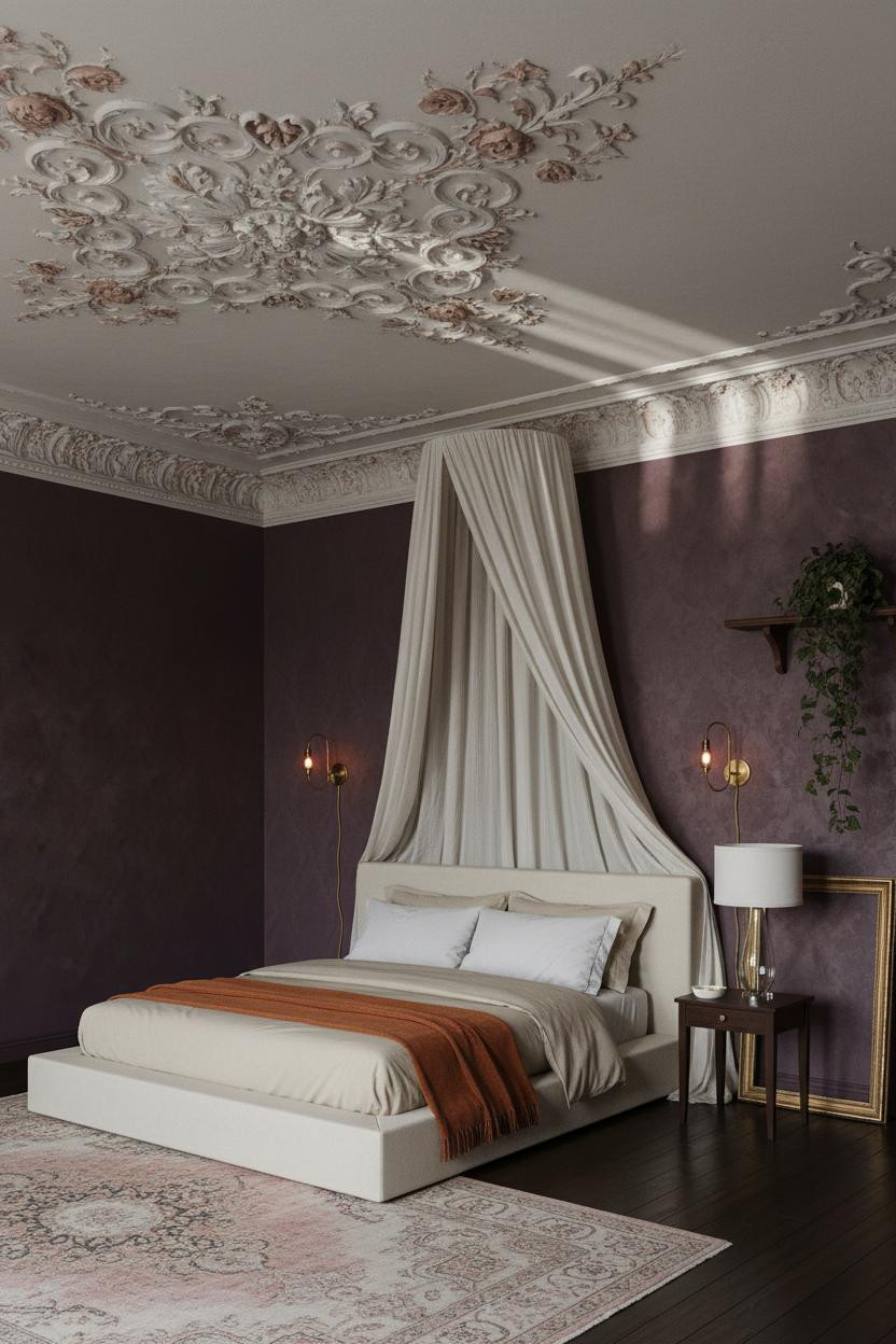
Somehow deep burgundy-plum and ivory silk canopy don't cancel each other out. They make each other stranger and more interesting.
What creates the mood: The aged plaster ceiling medallion with dusty rose frescoes twelve feet overhead pulls all the drama upward, so the burgundy walls below feel like a frame rather than the subject. Paired antique brass sconces cast amber pools that warm the damask texture without lighting the room too bright.
Skip this: Heavy drapes in a matching burgundy. The sheer ivory silk canopy above the bed works because it contrasts. Repeat the wall color in fabric and the room closes in.
Sage Green With Lace Curtains Is a Combination I Return To
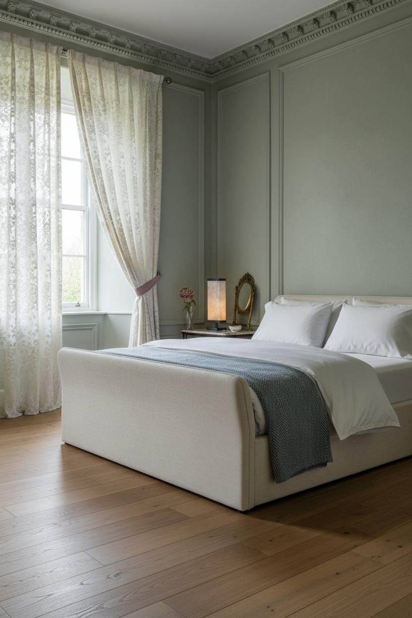
This is the one I'd actually live in. Quieter than the others. Older feeling, somehow.
Why it feels intentional: Dusty sage walls with matte aged-plaster texture and ornate dentil crown molding running the full perimeter make the room feel like it's been this way for a century. The ivory lace curtains tied back with dusty rose velvet ribbon add softness while still feeling storybook, not precious.
One smart swap: Replace any modern bedside lamp with an antique brass fixture. The reclaimed honey-toned wood floor already reads warm, and brass hardware connects to it naturally.
Blush Velvet Curtains Pooling on Parquet
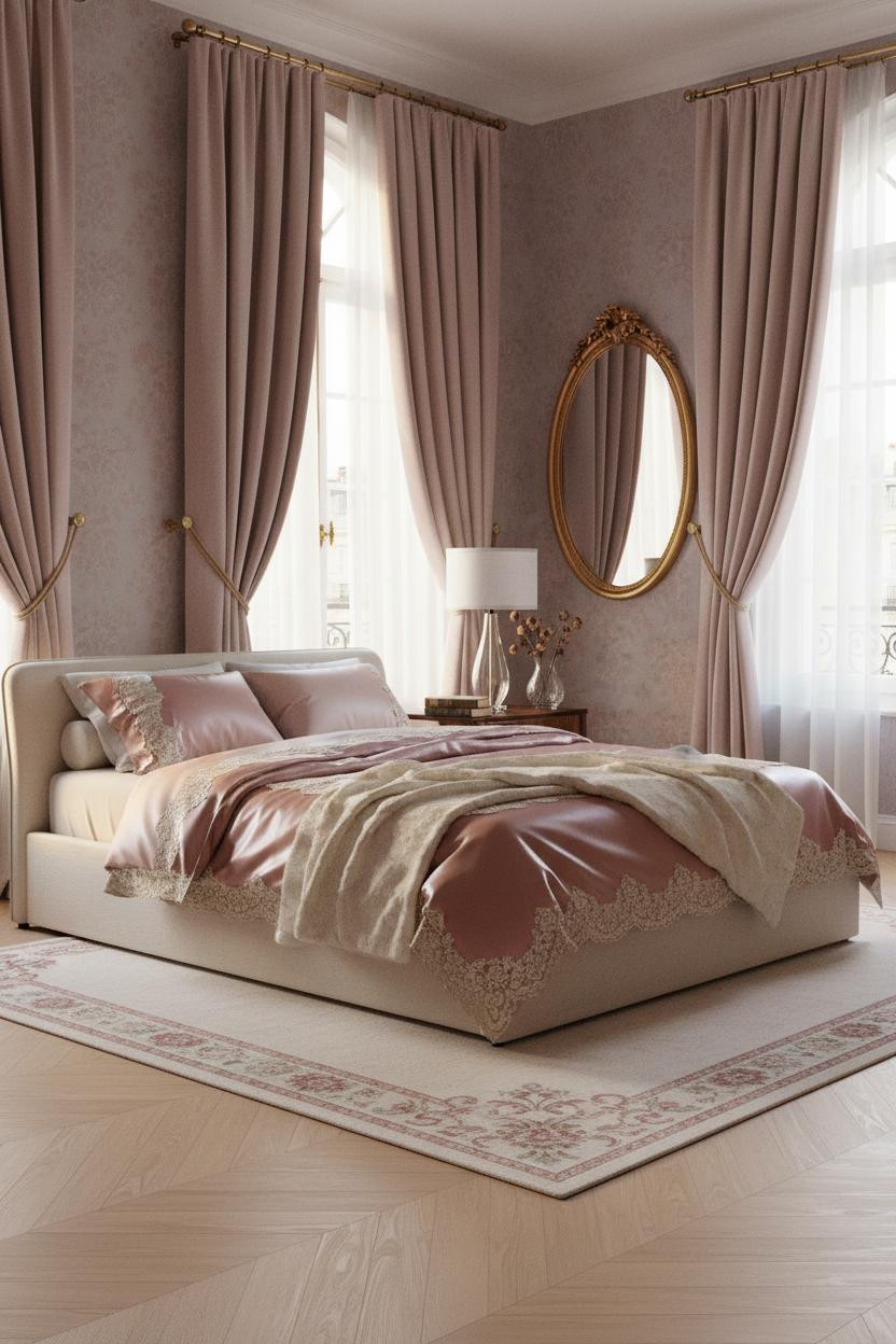
Floor-to-ceiling velvet curtains in blush mauve pooling on pale oak herringbone parquet is the kind of detail people photograph and can't explain why.
Why the palette works: The mauve-grey walls with vintage damask wallpaper keep the blush curtains from reading overly sweet, while the ornate brass hardware on the arched windows anchors the whole scheme in something older and more grounded. The room feels breathless and collected.
Where to start: The curtains. An adult princess bedroom lives or dies on its window treatment. Get the curtains right first, then build the rest around them.
 Our #1 Pick
Saatva Classic Mattress
America's best-selling online luxury innerspring. 365-night trial, lifetime warranty, free white glove delivery.
Shop Saatva Classic
Our #1 Pick
Saatva Classic Mattress
America's best-selling online luxury innerspring. 365-night trial, lifetime warranty, free white glove delivery.
Shop Saatva Classic
Why Luxury Bedrooms Always Feel Better
Every room on this list is doing something extraordinary with walls, light, or architectural detail. But the one thing none of them can afford to get wrong is the bed itself. Not aesthetically. Practically.
The Saatva Classic is where I'd start. Dual-coil support that holds its shape, a cotton cover that breathes through the night, and a Euro pillow top that's soft without losing structure. It feels like the good hotel kind. Not the business hotel kind.
Walls get repainted. Linen gets swapped out. The mattress stays. Start with the one that holds up.

The rooms people save are the ones where nothing looks accidental. Every cornice, every curtain, every lamp placed just so. Good design ages well because it's made well. Start with the bed. The rest figures itself out.


