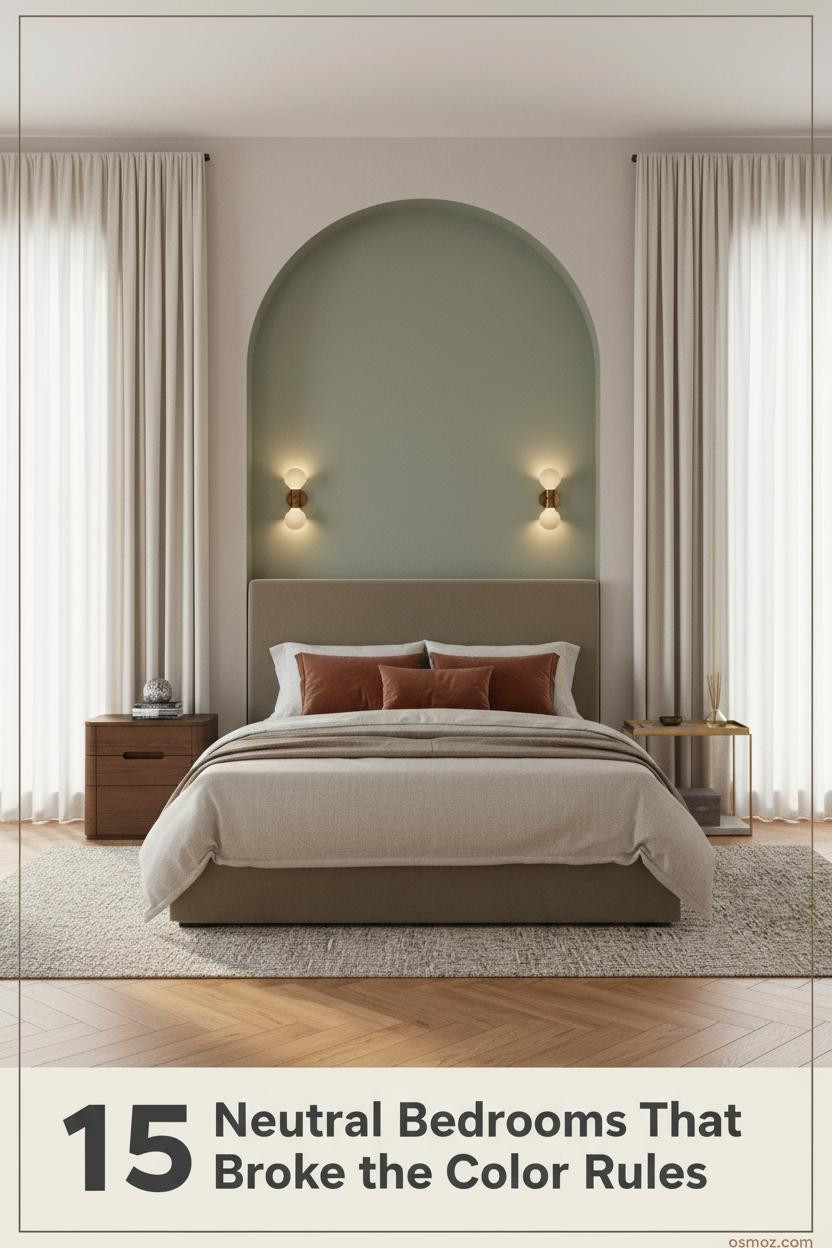
15+ Neutral Bedrooms With a Pop of Color That Actually Feel Pulled Together
18 march 2026The best neutral bedroom with pop of color doesn't look like a color theory exercise. It looks like someone made a choice and committed to it.
These 15 rooms prove you don't need much. One strong accent, the right neutral base, and the layering does the rest.
The Backlit Headboard That Changes Everything at Night
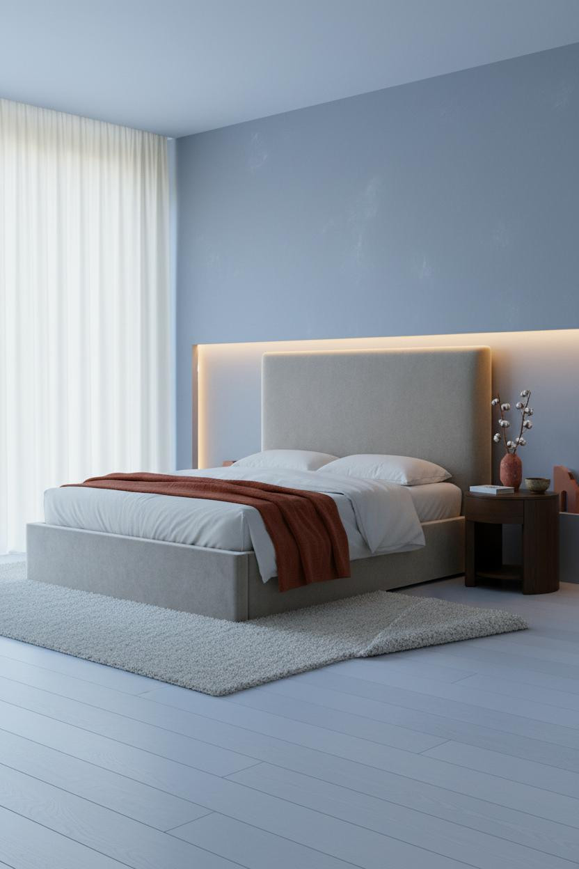

This one surprised me. The proportions shouldn't feel this deliberate, but they do.
A backlit frosted resin panel behind the bed does what most accent walls can't: it gives the room a light source with a shape. The warm amber glow against matte plaster makes the blue-grey walls look intentional, not cold.
Worth copying: Anchor the warm light with a terracotta linen throw at the foot. The two tones pull each other into focus.
How Limewash Walls Make a Rust Throw Look Expensive
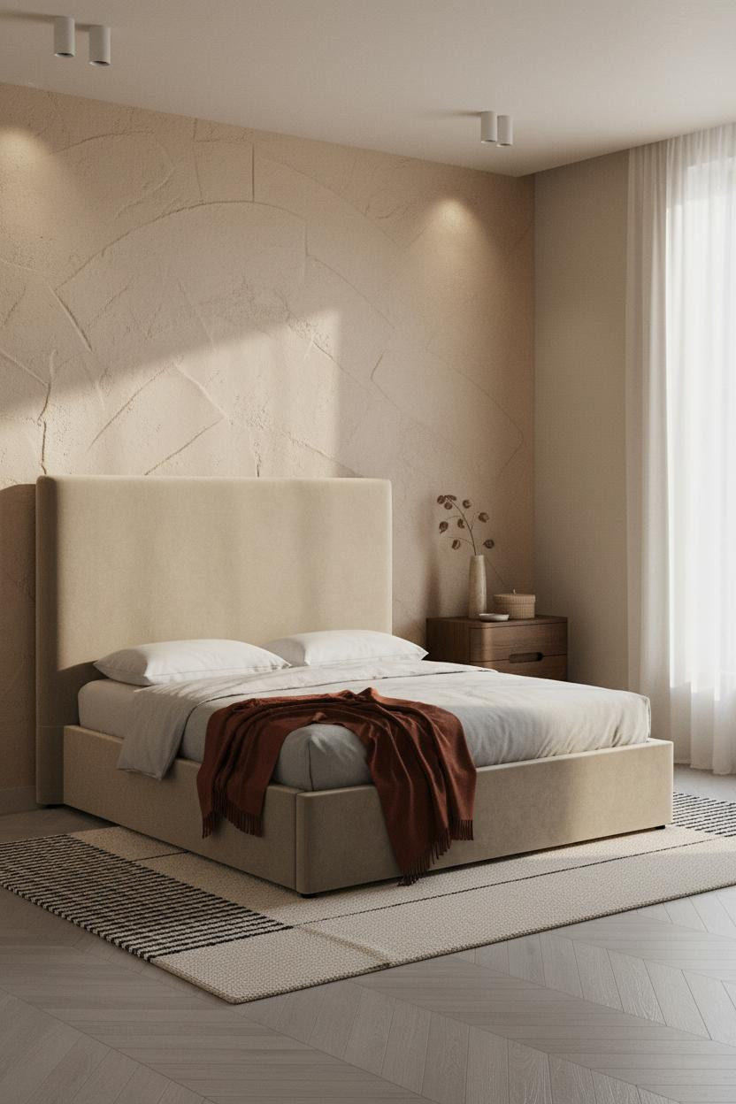
The warm sand limewash plaster isn't smooth. That's the whole point. Raking light catches the brushstroke grain and the wall stops reading as just a backdrop.
Why it works: The raw texture gives the rust mohair throw something to react against. On a flat painted wall, the same throw would look like a styling prop.
The easy win: Stone-washed grey bedding, not white. It keeps the palette grounded while the throw carries all the warmth.
One Cobalt Shelf in a Camel Room
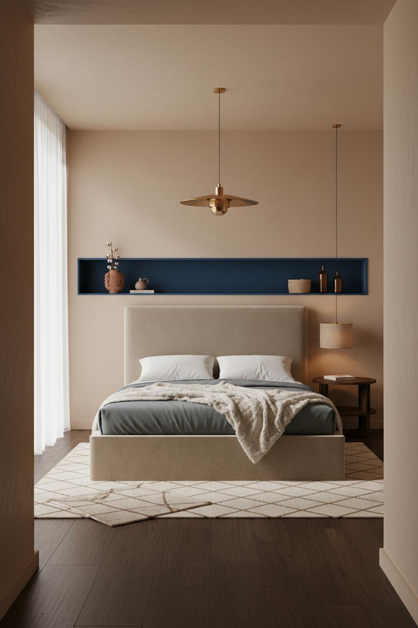

Divisive. But the rooms that commit to this kind of contrast age better than the safe ones.
A recessed shelf with its interior painted deep cobalt blue cuts a sharp horizontal line against soft camel matte plaster. The contrast is immediate. And honestly, a little thrilling.
Avoid this mistake: Don't put too many objects on the shelf. Two or three pieces, max. The cobalt needs room to breathe or it just looks cluttered.
The Sage Niche That Makes a Cream Room Feel Considered
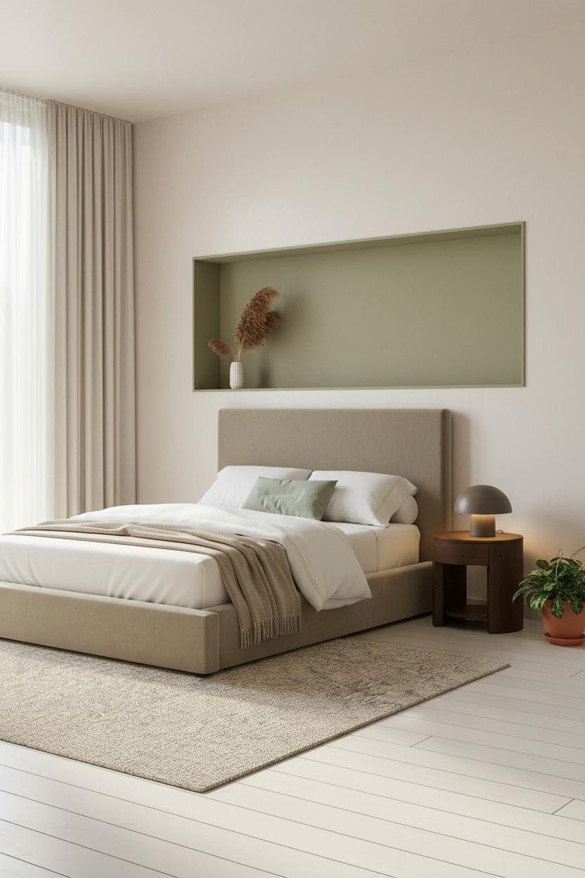

A floating niche with a warm sage green interior is probably the lowest-commitment color move in this whole list. And it pays off more than almost any of them.
What makes it work: The recess geometry frames the color so it reads as architecture, not just a paint choice. The surrounding cream walls make the sage look deliberate rather than accidental.
A single pampas stem in a white ceramic vessel on the ledge is all it needs. Nothing too precious.
A Teal Pillow Deserves More Credit Than It Gets
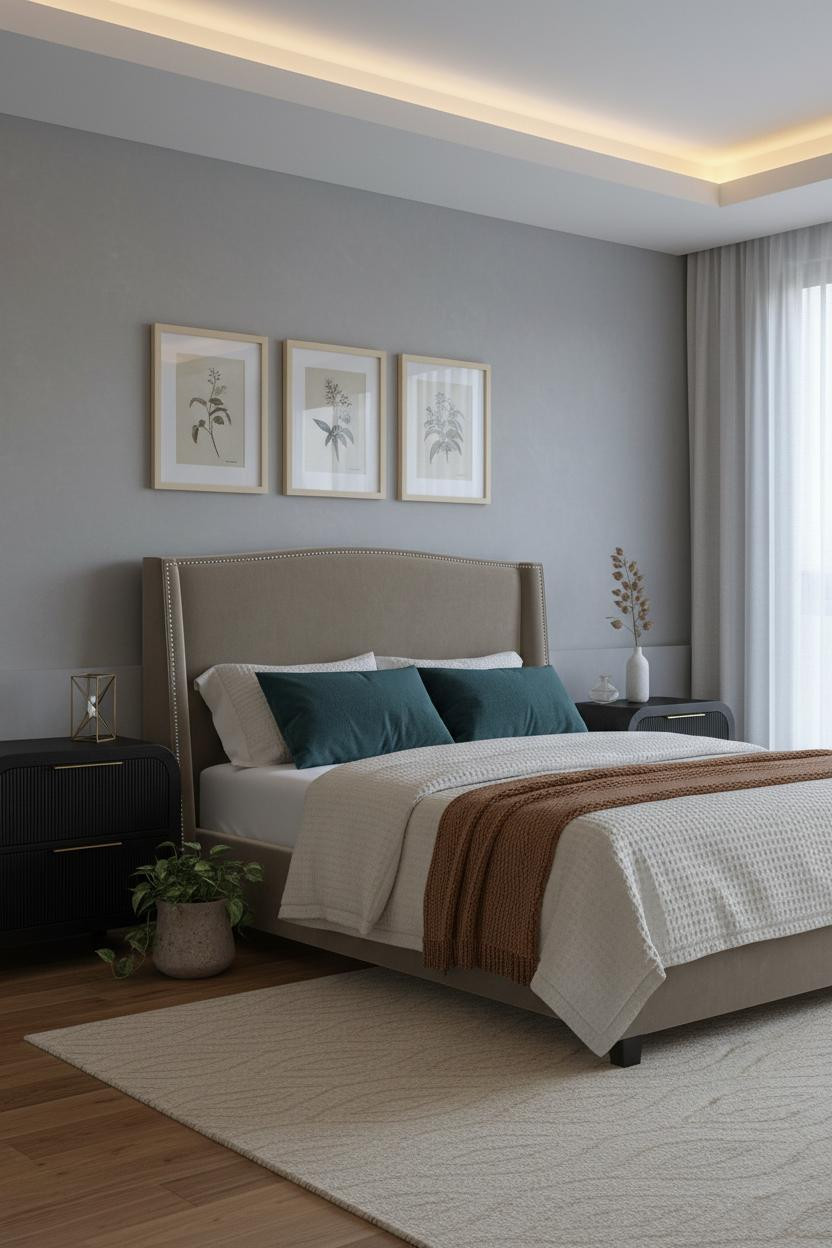
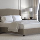
I keep underestimating what a single deep teal linen pillow does in a room built on dove grey and warm maple. It's enough color to register but not enough to take over.
Why it holds together: The botanical gallery prints in cream frames give the teal something to connect to. Same cool family, just quieter. The room feels collected rather than decorated.
The smarter choice: Position the teal pillow slightly off-center. Symmetry reads staged. Off-center reads lived-in.
Terracotta Curtains as the Statement Piece
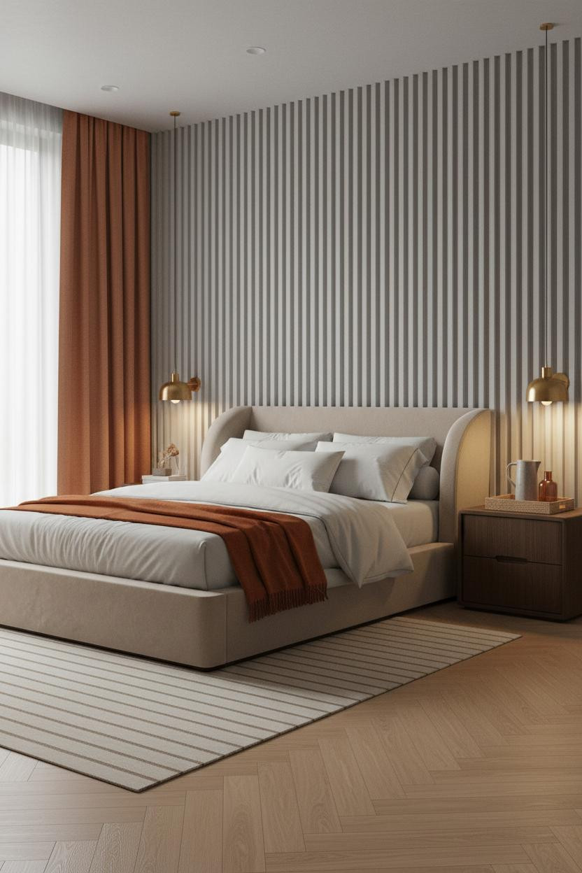

Most people put their color on the wall or the pillow. Floor-to-ceiling terracotta linen curtains change the scale entirely and the room feels warmer without a single coat of paint.
The real strength: The fluted limewash plaster wall behind the bed creates enough shadow rhythm that the curtains don't carry the whole room alone. Two textured surfaces, same warm tone family.
Pro move: Keep the bedding ivory percale. The contrast between the crisp sheets and the rich curtain drape is the whole composition.
What a Herringbone Oak Wall Does to a Dusty Rose Room
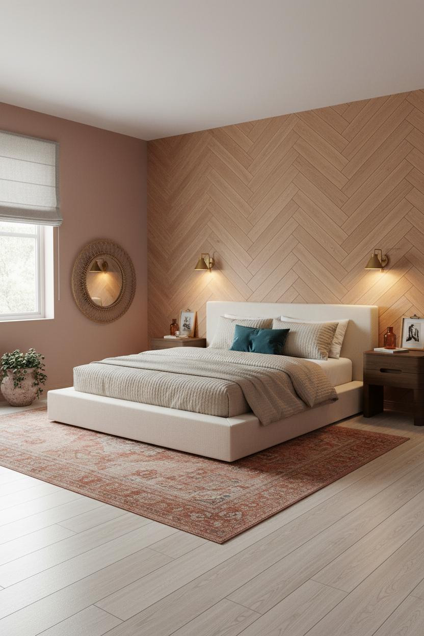
The honey oak herringbone feature wall grounds the dusty rose walls on either side in a way that plain wood paneling never would. The chevron pattern gives the eye a fixed point.
Why it feels balanced: Dusty rose is warm but soft. The oak is warm but graphic. Together they stop each other from tipping into either saccharine or heavy. And then there's the deep teal velvet pillow doing exactly what it should: just enough contrast to keep it interesting.
Where to start: The rattan mirror leaning against the wall. It connects the natural oak to the rest of the room without forcing the palette.
The Steel-Framed Window That Earns Its Sage Pillow
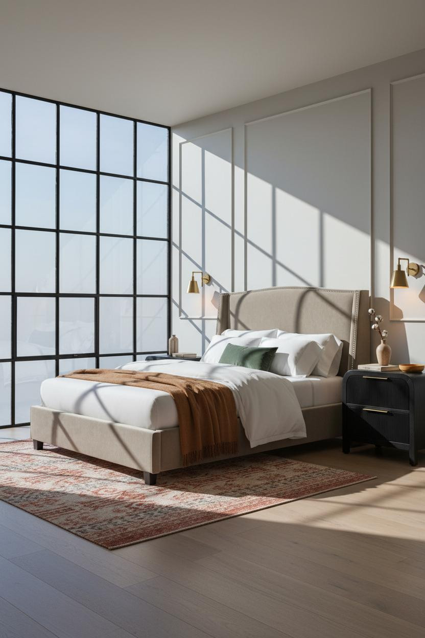
Fair warning. The black steel Crittall frames behind the bed make this look harder to achieve than it is. But they're doing serious structural work.
In a room this cool-toned, a sage green velvet pillow needs the greige walls and bleached oak floor to stay warm. The steel frames create just enough edge to stop the whole thing reading too soft.
Steal this move: A muted rust kilim runner on the floor ties the caramel throw to the warm flooring below. Two anchors, one color family.
When an Emerald Arch Is the Whole Room

I almost scrolled past this one. Glad I didn't.
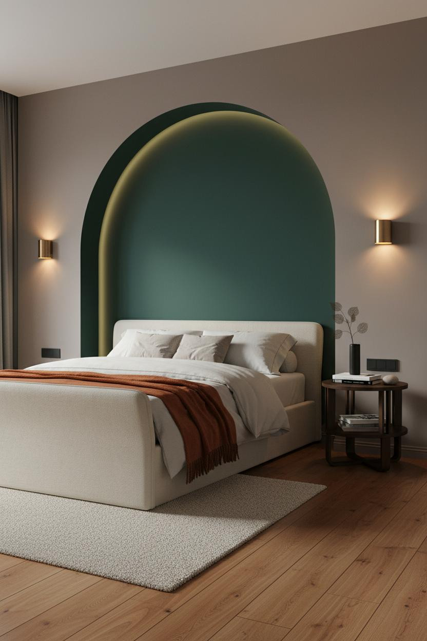
The deep emerald arched niche around the headboard zone is a commitment. But on mushroom matte plaster walls, the jewel tone reads as architecture rather than decoration. The curved arch catches diffused light along its inner edge, and the whole thing just works in a way I can't fully explain.
What to borrow: The rust-orange mohair throw at the foot. It connects the warm reclaimed wood floor to the green above. Without it, the palette would float.
Avoid this mistake: Don't add a second color. The emerald is the statement. Everything else needs to be neutral or warm earthy.
Exposed Brick and a Rust Throw. That's the Formula.
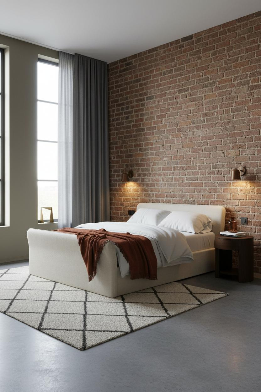
Nothing fancy. That's the entire point of this room.
What gives it presence: The exposed terracotta brick wall behind the bed already has color, texture, and depth baked in. The rust linen throw at the foot picks up the same warm tone and the room feels completely intentional while still feeling like someone actually lives there.
Charcoal floor-to-ceiling curtains keep the muted khaki walls from disappearing. Dark drapes, light walls. The contrast holds the room together without another accent color in sight.
Board-and-Batten Below, Warm Clay Above
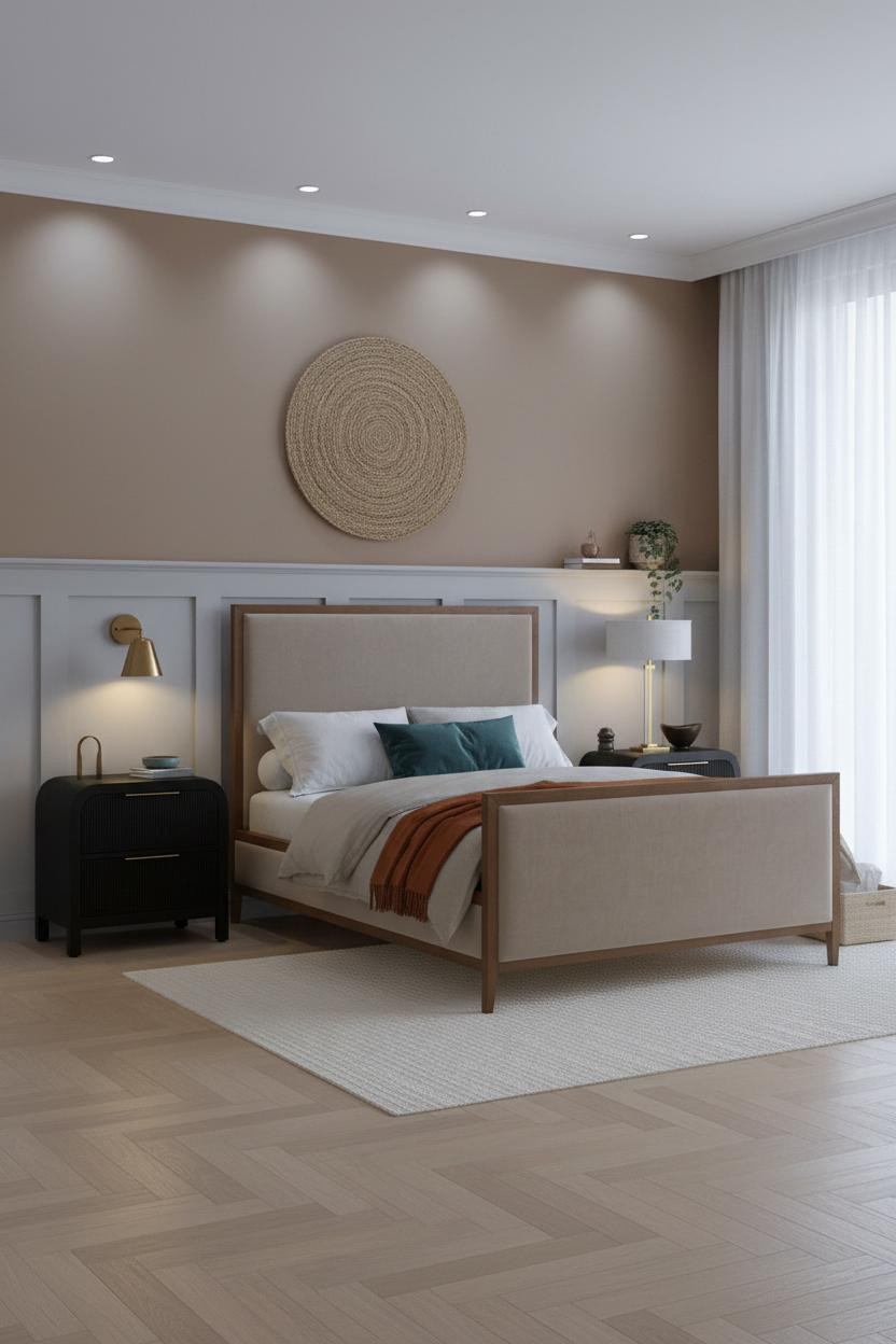

The two-tone wall treatment here is older than most trends, and I think that's why it holds up. Dove grey board-and-batten below, warm clay above creates a horizontal band that grounds the room's proportions without eating wall space.
What carries the look: The teal velvet pillow and burnt orange throw land softly because the clay upper wall has enough warmth to bridge between them. The colors don't clash. They share a temperature.
The finishing layer: A jute woven wall hanging above the bed connects the natural textures below to the two-tone architecture above. Just enough to keep it from feeling too geometric.
Burnt Sienna on a Board-and-Batten Wall
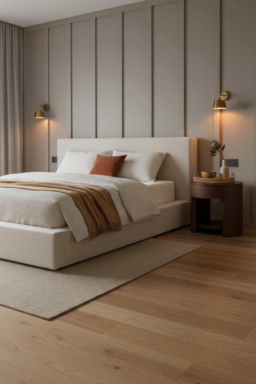
A single burnt sienna velvet pillow against soft taupe board-and-batten is a surprisingly low-risk move. The vertical batten lines already do the heavy lifting, so the color doesn't need to shout.
Design logic: The matte taupe finish catches raking ambient light along each batten edge, creating shadow rhythm that makes the wall feel architectural rather than flat. That texture is what makes the sienna pop without overwhelming oatmeal bedding beside it.
One smart swap: Trade a camel wool throw for a woven one in the same warm family. The variation in texture keeps the neutral base from going flat.
The Quiet Case for White Wainscoting and a Rust Pillow
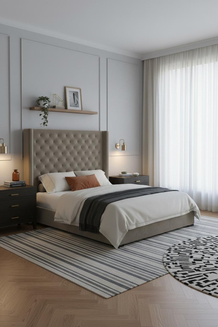


This is the room I'd recommend to anyone who says they're scared of color. The white paneled wainscoting half-height along stone grey walls creates so much structure that a single rust-orange linen pillow is all the color the room needs.
Why it looks custom: Scale and proportion, not decoration. The wainscoting rails lower the visual weight of the walls, which makes the honey oak herringbone parquet floor feel warmer and more prominent. A swivel chair in the far corner gives the room a function beyond sleeping.
What not to do: Don't add a second accent color. The charcoal cashmere throw is already a quiet contrast. That's enough.
Walnut Shelving in a Japandi Room That Actually Works
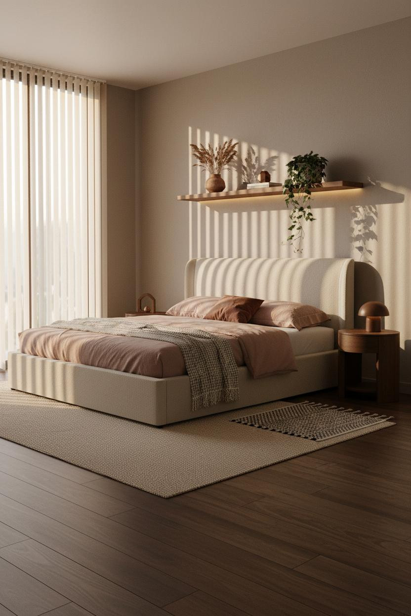

Japandi gets misused constantly. Most rooms labeled Japandi are just beige. This one earns it.
A floating natural walnut shelf mounted mid-height on warm greige matte plaster does exactly what Japandi is supposed to do: it gives the room a single material moment that connects the dark walnut flooring to the dusty pink linen bedding without forcing a transition. The terracotta pot with dried grass on the shelf is a quiet nod to wabi-sabi. Nothing too matchy.
The practical move: Slatted blinds over a full window let the late afternoon light do the decorating. The amber bars across the walls mean you need even less on them.
Cream Linen Curtains, Sage Pillow, Steel Blue Throw
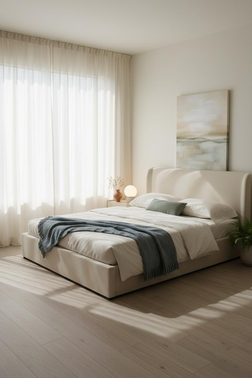
Two accent colors that should clash but somehow don't. A sage green pillow and a steel blue herringbone throw share enough cool undertone that they read as a quiet pair rather than a fight.
Why the palette works: Floor-to-ceiling cream linen curtains pull so much morning light into the room that both colors read softer than they would on a darker wall. The warm white matte walls keep the whole thing from tipping cold. The room feels calm and cohesive, which is the whole goal with a minimalist bedroom with pops of color.
The foundation: The oversized abstract canvas leaning against the wall (rather than hung) keeps it relaxed. And a swivel chair in the corner means the room works when you're awake too.
 Our #1 Pick
Saatva Classic Mattress
America's best-selling online luxury innerspring. 365-night trial, lifetime warranty, free white glove delivery.
Shop Saatva Classic
Our #1 Pick
Saatva Classic Mattress
America's best-selling online luxury innerspring. 365-night trial, lifetime warranty, free white glove delivery.
Shop Saatva Classic
The Foundation Of Every Beautiful Bedroom
Walls get repainted. Linen gets swapped. The accent pillow gets retired after two seasons. But the mattress stays. And it shapes how the room actually feels to be in, not just how it photographs.
The Saatva Classic is the one I'd put in every room on this list. The dual-coil support system holds up over years rather than months, the organic cotton cover breathes instead of trapping heat, and the Euro pillow top has that soft-but-structured feeling that makes you stay in bed longer than planned. Admittedly, that's not always ideal on a weekday.
But good design ages well because it's made well. Start with the bed. The rest figures itself out.

The rooms people save are the ones where nothing looks accidental. Pick one color, give it the right neutral to lean on, and commit. That's the entire formula.


