15+ Studio Apartment Ideas That Make Every Square Foot Count
17 march 2026The first thing you notice in the best studio apartment design is how nothing feels like a compromise. Every piece earns its place. And the whole room reads as intentional, not just small.
These 15 layouts prove that a tight footprint can still feel considered. Honest material choices, smart zoning, and one strong anchor piece per room. That's pretty much the whole formula.
The Oak Divider That Actually Zones a Studio
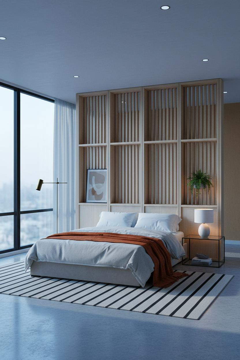


This one surprised me. A room divider that separates zones without closing the space is genuinely hard to pull off.
Why it holds together: The vertical slatted oak panel casts rhythmic shadow lines across the sleeping zone, creating a visual boundary that walls can't replicate while still letting air and light move through.
Steal this move: Pair the divider with a low platform bed and a warm bedside lamp so the sleeping zone feels enclosed without feeling cut off.
Japandi Shelving That Makes 400 Square Feet Feel Generous
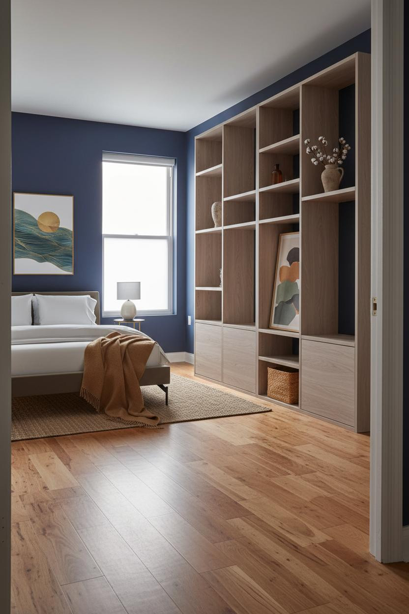

Honest confession: I used to think indigo walls in a small studio would feel oppressive. This room changed that.
What makes it work is the contrast: deep indigo plaster against full-height pale ash shelving creates enough visual tension that the room feels deliberate rather than cramped. The warm maple floor keeps everything from going cold.
The smarter choice: Use alternating open and closed shelf compartments. The closed sections reduce visual noise, and the open ones give the room somewhere to breathe.
Why the MCM Corner Window Works in a Tiny Layout
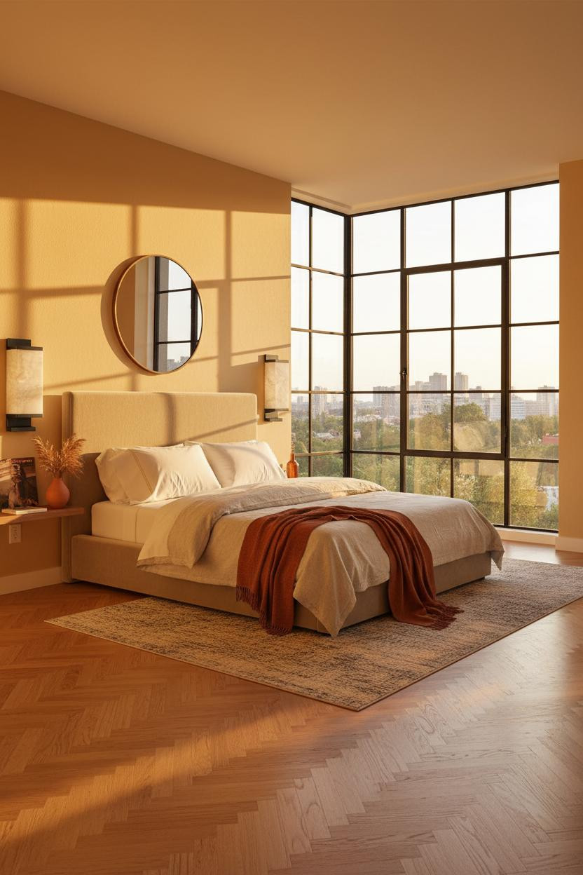
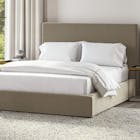
320 square feet with a corner window wall is not a limitation. It's a layout gift most people waste.
Design logic: The matte black steel grid across the corner windows draws the eye outward and upward, multiplying perceived depth the way a mirror does, only better because the light is real.
In a warm MCM scheme, the practical move is keeping furniture low and letting the geometry of the window do the heavy lifting. Don't compete with that grid.
Rustic Refined on a Budget That Actually Holds Up
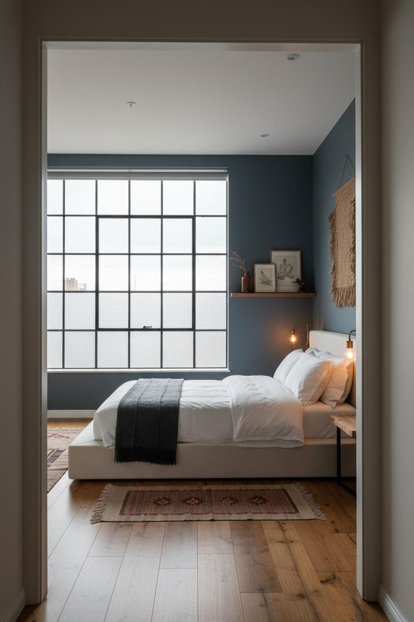
Fair warning: this look is harder to fake than it seems.
But when it lands, it really lands. What gives it presence: The combination of reclaimed wood plank flooring with warm slate-blue walls creates a grounded base that makes even sparse furniture look considered. The industrial window grid adds structure without any additional cost.
Where to start: Get the flooring right first. Everything else in a rustic refined studio either works with it or fights it.
The Arched Niche That Changes the Whole Sleeping Zone
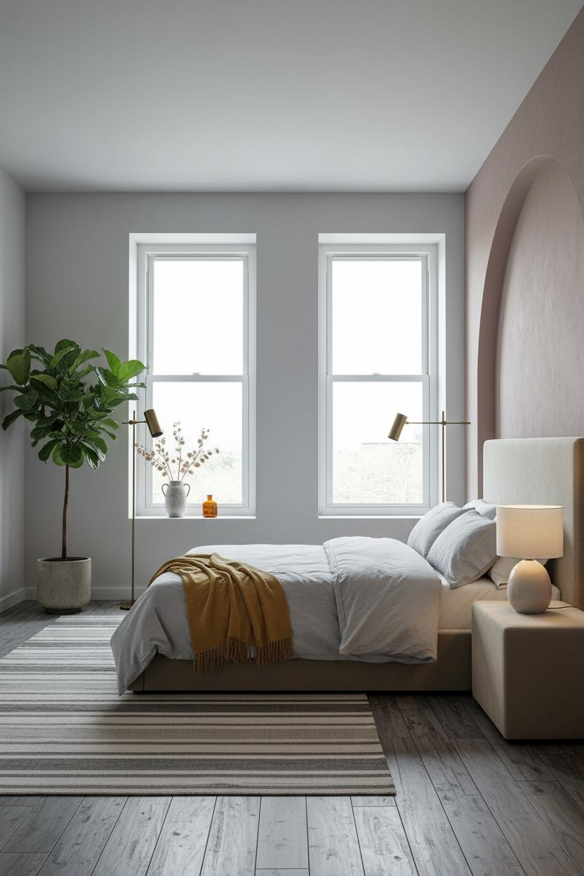
I keep coming back to this one. An arched niche in a studio apartment isn't decorative. It's spatial strategy.
Why it feels custom: The raw limewash plaster inside the arch catches light differently at every hour, so the sleeping zone shifts from architectural to intimate without changing a single piece of furniture. That kind of built-in variety is hard to buy.
Pro move: Add a large plant in the corner beside it. The organic shape against the hard curve is what makes the whole setup feel alive rather than staged.
Built-In Shelving That Grounds a Modern Farmhouse Studio
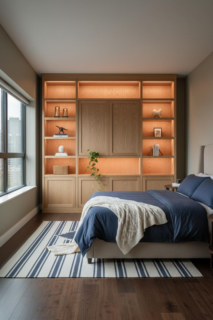

Nothing fancy. That's the point.
What carries the look: Full-height natural white oak shelving spanning the living zone wall gives the studio a structural anchor that freestanding furniture simply can't replicate. The dark walnut floor keeps the oak from reading too light or unfinished.
Avoid this mistake: Don't over-style the shelves. Two or three objects per compartment. A trailing pothos, a basket, a brass bookend. Anything more and the storage starts to compete with the room.
The Japandi Studio That Nailed Ceiling-Mount Storage
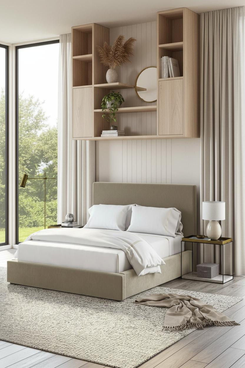
I almost scrolled past this. Glad I didn't.
What makes this one different: Ceiling-mounted pale ash wood shelving spanning wall-to-wall pulls storage off the floor entirely, which means the chunky cream wool rug and polished concrete beneath it read as uninterrupted ground plane. The room feels twice as open without losing an inch of storage capacity. And the vertical board-and-batten accent behind the sleeping zone gives the layout a quiet focal point that isn't the shelving.
Terracotta Accent Wall with Modular Storage in 375 Sq Ft
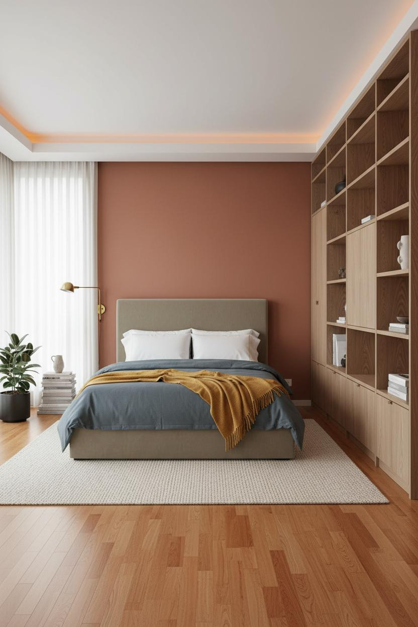

Terracotta behind the sleeping zone is a divisive move. But when the rest of the palette is neutral, it somehow just works.
Why the palette works: The warm terracotta reads as a grounding note rather than a statement because the natural ash modular shelving across the opposite wall pulls so much visual weight. Two bold decisions balance each other.
In a small apartment layout, the easy win is a swivel reading chair in a corner. It zones the space without blocking flow, and you actually use it.
Coastal Modern Small Space Storage That Doesn't Look Rental
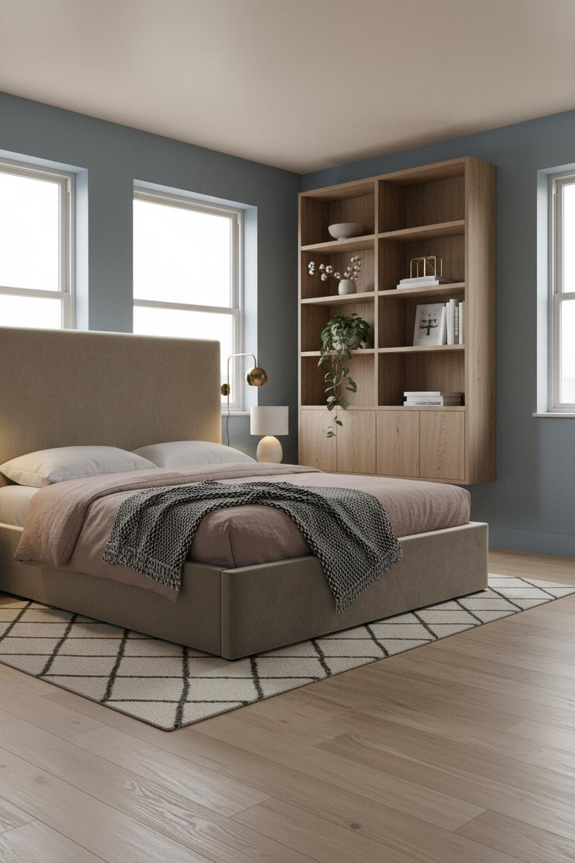
The room feels calm and cohesive in a way that most coastal-inspired studios don't quite manage.
Why it lands: Stone blue walls with a warm white ceiling give the vertical plane a softness while the bleached oak flooring below keeps everything grounded. The floating oak shelving ties both surfaces together without needing a third color.
What not to do: Skip the matching bedding-to-wall color move. A dusty pink linen duvet against stone blue is the contrast that makes a small apartment interior feel put together rather than matchy.
Sage Walls and a Platform Bed That Reframes 400 Square Feet
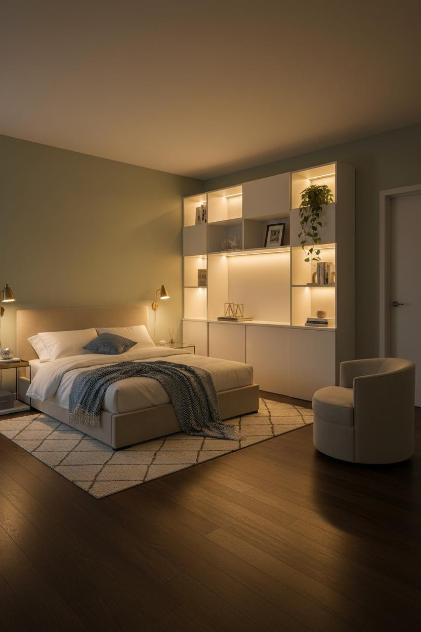
Admittedly, soft sage in an evening-lit studio is not a bold choice. But the payoff is real.
The real strength: Low ambient light pools from the bedside lamp while the matte white lacquer shelving opposite reflects it back across the room. The sage walls absorb enough warmth to keep the whole thing from feeling cold.
Worth copying: A swivel reading chair positioned near the entry creates a buffer between the sleeping and living zones in a way that a sofa never manages in tight quarters.
I Didn't Expect Pale Oak to Carry a 350 Sq Ft Studio This Well
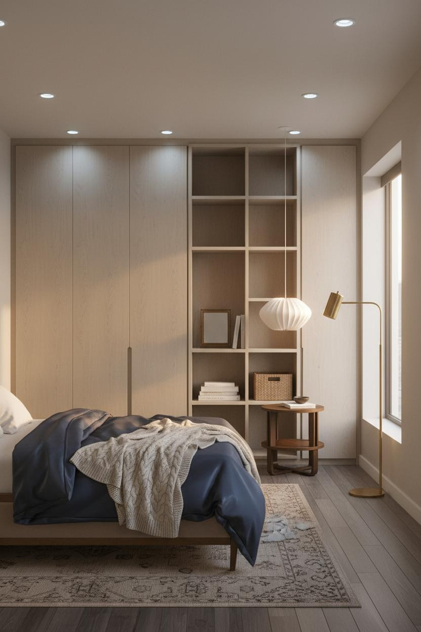

Having floor-to-ceiling storage on one full wall changes how you actually move through a studio. Everything else opens up.
What gives it depth: The pale oak built-in shelving against warm greige plaster creates a tonal harmony where the grain becomes the texture. Shadow lines between compartments do the work that pattern or color would otherwise need to do.
The finishing layer: A sculptural pendant above the nightstand instead of a table lamp keeps the surface clear and pulls the eye upward, which makes the ceiling feel higher.
Clay Plaster Accent Wall in a Japandi Studio That Actually Works
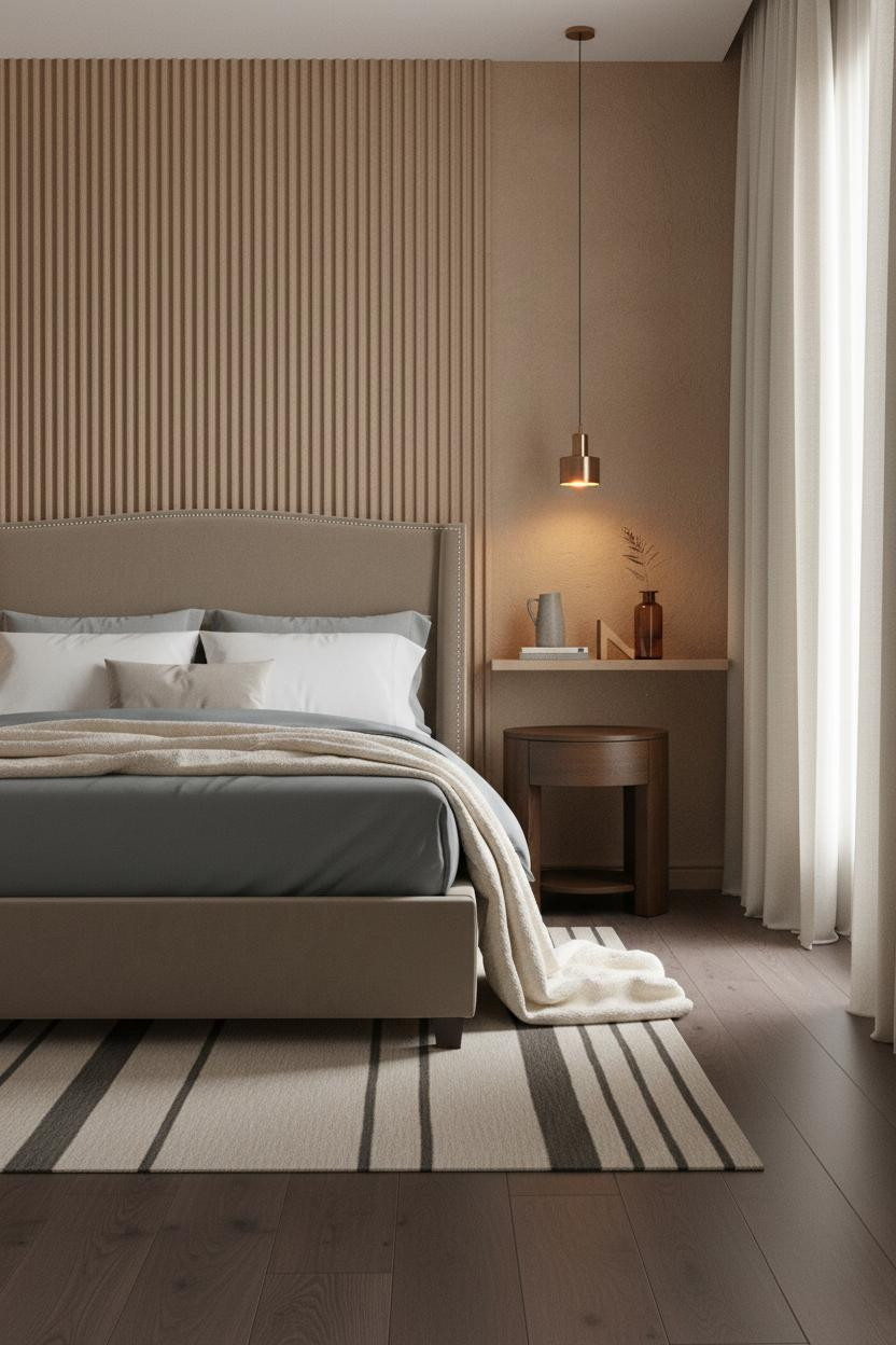
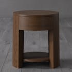
This is the kind of room that makes you want to slow down the moment you walk in.
Why it feels intentional: Hand-applied warm clay plaster catches diffused light across its ridged surface, so the wall reads as dimensional rather than flat. It's one material doing the work of texture, color, and focal point all at once. And the dark walnut flooring below grounds the warmth so the whole 18-foot studio holds together.
The key piece: Floor-to-ceiling linen curtains frame the window without blocking light. In a tight studio, scale matters. Anything shorter makes the ceiling feel lower.
Sage Board-and-Batten With a Platform Bed on Herringbone Floors
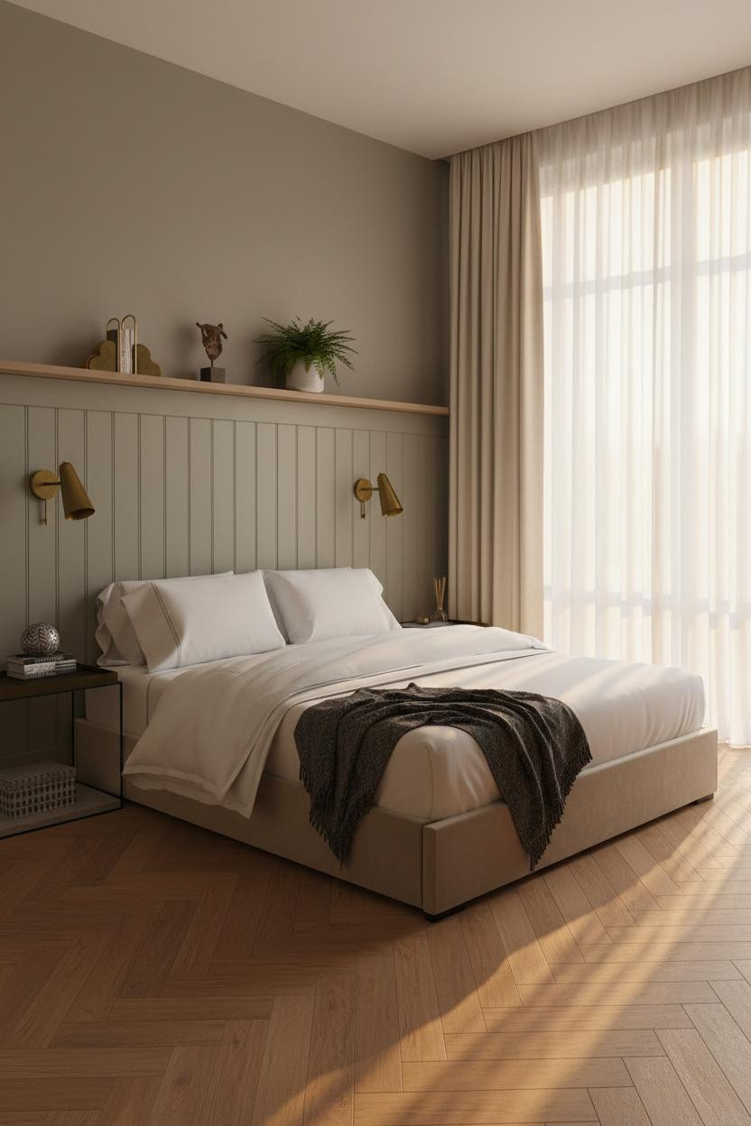
Bold choice. But when it works, it really works.
The sage board-and-batten accent wall creates vertical rhythm in a compact footprint, in a way that flat paint simply can't replicate. And the warm honey herringbone parquet flooring below pulls the room's eye downward and outward, making the floor feel larger than it is.
One smart swap: Replace a standard reading chair with an upholstered accent chair positioned toward the window. It zones the space without a divider and gives you a genuine reason to be in the room beyond the bed.
Boho-Modern Oak Shelving That Earns Its Place in a Small Studio
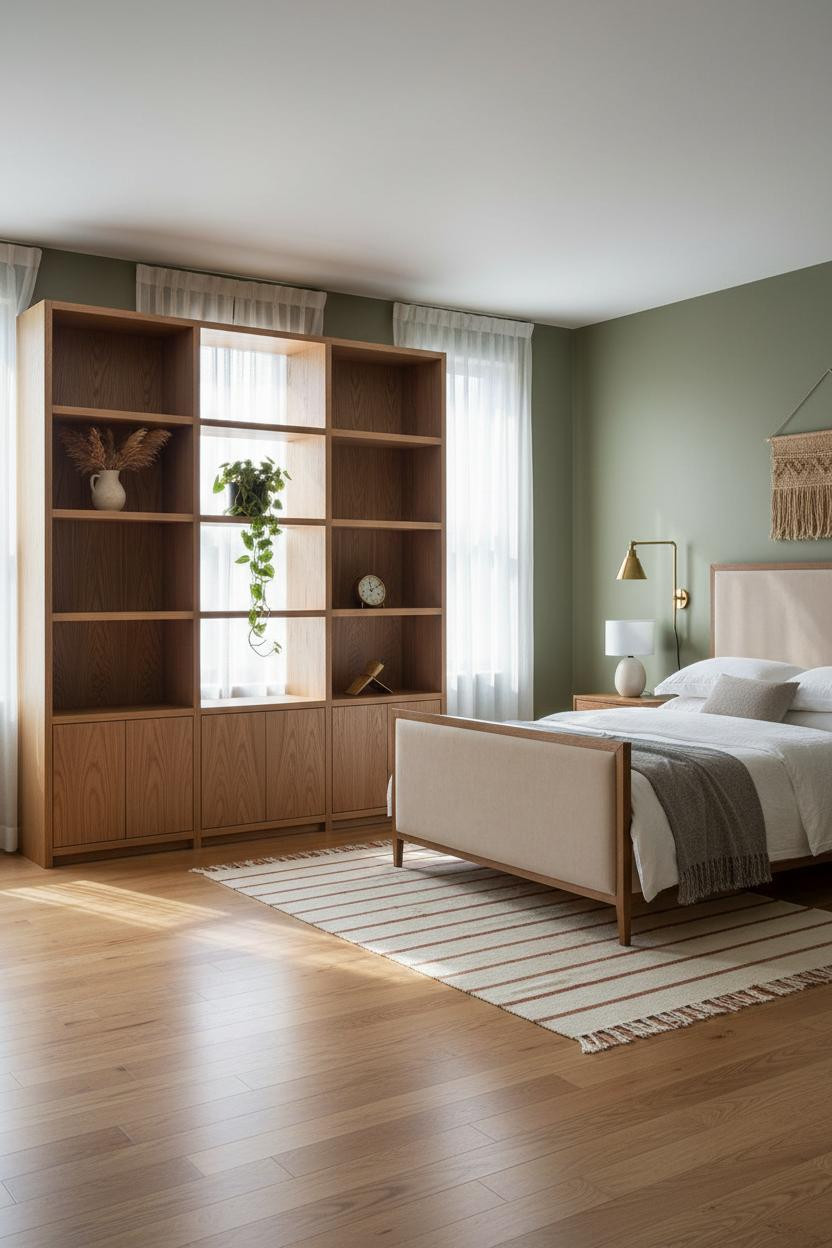
Olive walls are underused in small apartments. They're warm without being heavy, which is exactly the balance a single-room layout needs.
What softens the room: A natural jute woven wall hanging above the sleeping zone introduces texture at the one place your eye naturally rests, while still feeling collected rather than decorated.
Swap the natural white oak shelving for anything darker and the room tips. The olive walls need a light foil. That contrast is the whole move.
The Scandi-Modern Studio Where Light Does All the Work
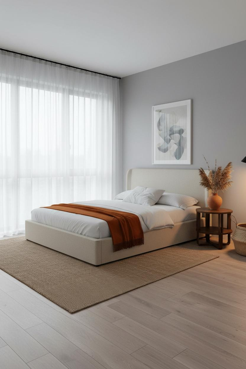

In a Scandi-modern studio, the layout decision that matters most isn't furniture. It's where you hang the curtains.
Why it looks bigger: Ceiling-mounted sheer linen curtains on a matte black steel rod draw the eye from floor to ceiling across the full window wall, making the glazed surface read as architectural rather than just functional. The pale birch flooring below reflects the north light back into the room.
Don't ruin it with: Heavy drapes, a patterned rug, or anything that interrupts the pale neutrals. The whole look depends on restraint.
 Our #1 Pick
Saatva Classic Mattress
America's best-selling online luxury innerspring. 365-night trial, lifetime warranty, free white glove delivery.
Shop Saatva Classic
Our #1 Pick
Saatva Classic Mattress
America's best-selling online luxury innerspring. 365-night trial, lifetime warranty, free white glove delivery.
Shop Saatva Classic
The Foundation Of Every Beautiful Bedroom
Every studio in this list gets the walls right, the storage right, the lighting right. But the one thing you feel before you notice anything else is the bed. And in a room where you sleep, work, and live inside the same four walls, that matters more than it does anywhere else.
The Saatva Classic is where I'd start. Dual-coil support means the structure holds through years of use, not just the first few months. The breathable organic cotton cover pulls heat away so you're not waking up uncomfortable, and the Euro pillow top is soft in the way that actually feels like it costs what it costs.
Walls get repainted. Linen gets swapped. The mattress stays. Start with the bed. The rest figures itself out.

The studios people save and come back to aren't the ones with the most square footage. They're the ones where every choice looks like it was made on purpose. Good design ages well because it's made well.


